My second attempt. What do you guys think? (9 Viewers)

Natuie

Sitting Out
Joined
Oct 7, 2024
Messages
34
Reaction score
14
Location
Syd
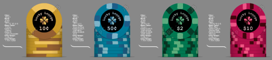
I know these are a very simplistic design but that was what I was going for. I took your advice from the first mockup but I'm still not sure what exactly these are missing. Something just doesn't look right and I can't put my finger on it. I'm just looking for general feedback and your opinions on the designs. Do you guys like the matching logo colours? I'll take any feedback on board and much appreciate the help. Thanks (STOP TELLING ME TO CHANGE THE DENOMINATIONS lmaoooo)


Also I'm new here so is it ok for me to post a new thread like this for a new design?
Chip Set.png
 
I’ve always said each chipper has to like what they like.

I have one black label custom and it works. I think because of the white accents. Otherwise they’re too dark for me. If you’re spending bigger money on the labels just get it right for you.

Have you done anything lighter? Grey and off white are blech.

Who you using for your labels?

I do like the matching logo colors. Nice touch. On a lighter label it would pop and be easier to notice that they match the chip.

The gold and the blue seem to work with the black label but the other too make the chip a little dark for me.
I'm kind of just experimenting and learning atm not ready to order anything yet. Also thats a good point I might adjust the colours of the higher denoms
 
Do you own a color sample from cpc? Red and mandarin red are nearly identical imo so you’d have trouble making out the edge spot for that chip.
 
Do you own a color sample from cpc? Red and mandarin red are nearly identical imo so you’d have trouble making out the edge spot for that chip.
Whats a colour sample and where can I get one
 
I'm kind of just experimenting and learning atm not ready to order anything yet. Also thats a good point I might adjust the colours of the higher denoms
Could you go black on the lowest demon and lighten a shade with each chip thru the last one. Aside from it being overall a little too dark, the dark”er” labels maybe do work. And it’s hard to tell from the pics because it might be pic dependent but if it is a little tough to read on those darker chips maybe a font adjustment, type or size might also be part of the solution. Can’t say it again that the matching color between Chip and label is cool.
 
Made a couple adjustments. Not sure if I like the pink colour. What do u think?

Could you go black on the lowest demon and lighten a shade with each chip thru the last one. Aside from it being overall a little too dark, the dark”er” labels maybe do work. And it’s hard to tell from the pics because it might be pic dependent but if it is a little tough to read on those darker chips maybe a font adjustment, type or size might also be part of the solution. Can’t say it again that the matching color between Chip and label is cool.

V1:
Chip Set.png


V2:
Chip Set V2.png
 
While I like the logo in the inlay to match the chip colors, I’m not a fan of the text matching the chip colors. Have you tried white text on these inlays? I imagine it would pop more.
 
While I like the logo in the inlay to match the chip colors, I’m not a fan of the text matching the chip colors. Have you tried white text on these inlays? I imagine it would pop more.
Holy shit why does that look so much better. You're a lifesaver man
 

Attachments

  • Untitled.png
    Untitled.png
    162.3 KB · Views: 35
The number of the denomination needs to be centered without the dollar/cent symbol. The symbol with a smaller font size than the number will look more balanced.

You need to get a color sample from CPC and look at the different colors in different lighting.

My preference for a black inlay is brighter base colors. I like retro red, the brightest red IMO, with maroon and dayglo pink spots and it is a popular combo. Lots of people like dayglo yellow for a base color but I prefer canary as dayglo yellow looks green to me in natural light. I used a light blue base.

1000002811.jpg
 
The number of the denomination needs to be centered without the dollar/cent symbol. The symbol with a smaller font size than the number will look more balanced.

You need to get a color sample from CPC and look at the different colors in different lighting.

My preference for a black inlay is brighter base colors. I like retro red, the brightest red IMO, with maroon and dayglo pink spots and it is a popular combo. Lots of people like dayglo yellow for a base color but I prefer canary as dayglo yellow looks green to me in natural light. I used a light blue base.

View attachment 1402384
Thoughts?
Chip Set V4.png
 
I think the $10 chip looks good on its own but not sure if dayglo pink fits in with the rest of the set because it’s so bright vs the rest of the more classic colors. Have you tried regular pink?

Also, for the blue chip I’d consider changing the blue spot to either dark blue or retro blue to give a bit more contrast
 
http://www.classicpokerchips.com/samples.htm

Please buy a color sample, it’s a must if you want to buy a custom cpc set
+1

It’s essential when spending this much money on a custom set. Colors in the designer look different from real life. Not completely different, but a sample set may change some details in your set. Like going with a different kind of red than what you originally thought when looking at the colors on screen.

Edit: no you don’t need a CPC color sample set if it’s for Tina chips
 
Also noting if it’s from a group buy from Tina, you can look at the catalogue from previous designs and see what you like, you can purchase old designs. You can mix different chips from different sets and request your custom label to be put on instead of the existing one.
 
IMO I think your text colour and clover need some colour work. The black is a very dark background and, while it looks great, as do the chips, you’re going to need to play with values on the image on the label for it to look right.

This to me means: lighter shades of the colour (much nearer white), lighter clover shades with each being closer in value vs. Current where one is very dark compared to the other.

Just my opinion here but I think there’s a better typeface out there too.
 
I've given this some thought, and I dislike your fonts and the size. You should try to change them for both the text and the numbers / symbols.

I say dislike because it will be hard to read on the chip.
 
I cannot in good conscience be involved in a serious design project using that combination of colors and denominations.
 
Can't you just add another zero and pretend? Then a blue 1, red 5, yellow 20, and black 100 make sense.

But for 10c, 50c, 2, and 10, using white, red, and green is just asking for trouble. Blue, yellow, and black too, probably.
 
I don't care about the colours that are used as long as they are not prone to dirty stacks and they can be easily told apart.

Similarly, I don't care about the denoms that are used as long as they are clear and bets can be logically constructed.

However, I still feel there are some design hurdles here. The colour-matched denoms clearly do NOT work here with the black background.

The central graphic has bilateral symmetry but again I can't tell because the background is so dark and the multiple hues do not stand out well against it.
 
Can't you just add another zero and pretend? Then a blue 1, red 5, yellow 20, and black 100 make sense.

But for 10c, 50c, 2, and 10, using white, red, and green is just asking for trouble. Blue, yellow, and black too, probably.
I mean I could do that... but my mates and I really only play $20 buy ins. Also I wanna make it my own set idrc about the traditional denoms and colours and its not like I'm using something unconventional like 70c or something
 
I don't care about the colours that are used as long as they are not prone to dirty stacks and they can be easily told apart.

Similarly, I don't care about the denoms that are used as long as they are clear and bets can be logically constructed.

However, I still feel there are some design hurdles here. The colour-matched denoms clearly do NOT work here with the black background.

The central graphic has bilateral symmetry but again I can't tell because the background is so dark and the multiple hues do not stand out well against it.
What do you mean by colour matched demons? The outline around the numbers and words? Also do you recommend I change the background colour? And what colour should I use? I'm not very artsy just kinda fiddling around till i get something nice. New to all this so ik it's not gonna be perfect the first time
 

Create an account or login to comment

You must be a member in order to leave a comment

Create account

Create an account and join our community. It's easy!

Log in

Already have an account? Log in here.

Back
Top Bottom