Need help voting on custom design (1 Viewer)

Mushmanchuman

3 of a Kind
Supporter
Joined
Dec 8, 2019
Messages
633
Reaction score
1,762
Location
Michigan
I reached out to a designer friend for custom artwork. I think she knocked it out of the park. I have a few that are my favorites but I am going to sit on it for a bit to make sure I weigh out my options.

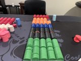
Please tell me which one you like and why. No feelings to be hurt on my end. I'll describe the chip idea after I label the chippys!
d6d3a724-6a18-4ecd-b429-72e301b4782c.jpeg
 
Truck should point right- moving forward. Pointing left is going backwards.

The chip and the inlay together are needed, makes a huge difference.

4 caught my eye, and is my favorite black inlay. 1, with the truck reversed, would be my favorite white inlay. I’d need to see them on the set of chips, though.
Chips will be solids
 
Love the concept. I hope there’s a backstory on why the old wrecker and garage name. And if not, still love the design.

I love the idea of a black chip, but the numbers are sitting on a white square which I don’t care for. What if the red numbers were just outlined in white in lieu of the white square? That said I’d go with #5 if you go with black.

But then I studied #1 and really got into the font of the number and text. They both compliment each other nicely. The only change I world suggest is to remove the horizontal lines and the single arc. The chip doesn’t need it and it looks too busy with it. Hope you don’t mind, but I did a quick edit on it without those lines. This is what I would go with. And I would leave the truck in the current position as it works well with the text spacing and the capital letters.

Nice design!


IMG_9712.jpeg
 
Nice design!
Thanks! #1 is the one that I am leaning towards myself. That and #4. I like what you did removing the lines and agree about it being less busy.

The garage was built in the 1940's up in the village I grew up in. By the 1980's the town was barley hanging on with just a post office, hardware store, garage and a general store. By 2011 the only business left was the garage. One guy worked there for 20 years until the garage got razzed this last year. It was falling apart.

When I was a kid all the men in the town would meet up there at 10am to tell war stories and play cribbage. I really thought that was cool and wondered what those old boys must have discussed. I worked there for a summer when I was 12. It was horrible.

There wasn't a lot from my home town to use as inspiration for a chip design. I liked the way "Lupton Garage" sounded and the design idea was simple nice and simple with the tow truck. And it is a way to honor a place that no longer exists.
70862624_10156771643831819_2649081707289903104_n.jpeg
 
Thanks! #1 is the one that I am leaning towards myself. That and #4. I like what you did removing the lines and agree about it being less busy.

The garage was built in the 1940's up in the village I grew up in. By the 1980's the town was barley hanging on with just a post office, hardware store, garage and a general store. By 2011 the only business left was the garage. One guy worked there for 20 years until the garage got razzed this last year. It was falling apart.

When I was a kid all the men in the town would meet up there at 10am to tell war stories and play cribbage. I really thought that was cool and wondered what those old boys must have discussed. I worked there for a summer when I was 12. It was horrible.

There wasn't a lot from my home town to use as inspiration for a chip design. I liked the way "Lupton Garage" sounded and the design idea was simple nice and simple with the tow truck. And it is a way to honor a place that no longer exists.View attachment 1364233
Fantastic story and reason behind your design. Thanks for sharing. No matter what design you go with, these chips are going to be a perfect tribute.
 
I like 3 as it's the easiest to read.

My great grandparents used to have a place in South Branch. My dad used to take us to the Lupton sand drags. I also have memories of playing putt putt at the Sunoco station. With that being said I'm a fan of your theme. Very cool.
 
I like 3 as it's the easiest to read.

My great grandparents used to have a place in South Branch. My dad used to take us to the Lupton sand drags. I also have memories of playing putt putt at the Sunoco station. With that being said I'm a fan of your theme. Very cool.
Parkview Acres! That place is what killed Lupton. South Branch is a fun little place. Little.
 
I really like 3 for white and 5 for black. 1 and 2 have such tiny lines and dots around the outside. I just wonder if there would be a problem getting all that to print clearly on a small chip label. And I also love the story behind the chips! They will be a wonderful tribute!
 
Here is what I wanna do for the sets. I’m working with what I got here…

Brown nickels
Pink quarters
White dollars
Red fives
Blue twenties
Preferably I’d have more $1’s and .5’s but this can work
IMG_1581.jpeg
IMG_1582.jpeg
Tournament set. The only thing I was thinking about is swapping out the peach 1000 for the pink .25’s

With this setup I can run 25 starting stacks of t10000 with a rack of red 5,000 and a barrel of light blue 25,000 on deck for color up.

I asked my designer if I can do #1 design for cash and #4 for tourney.
Or just #1 design for everything. We’ll see what she says.

I went with #1 as my favorite with the double lines removed. We may or may not flip the truck on #1
IMG_1583.jpeg
 

Attachments

  • IMG_1582.jpeg
    IMG_1582.jpeg
    125 KB · Views: 16
Last edited:

Create an account or login to comment

You must be a member in order to leave a comment

Create account

Create an account and join our community. It's easy!

Log in

Already have an account? Log in here.

Back
Top Bottom