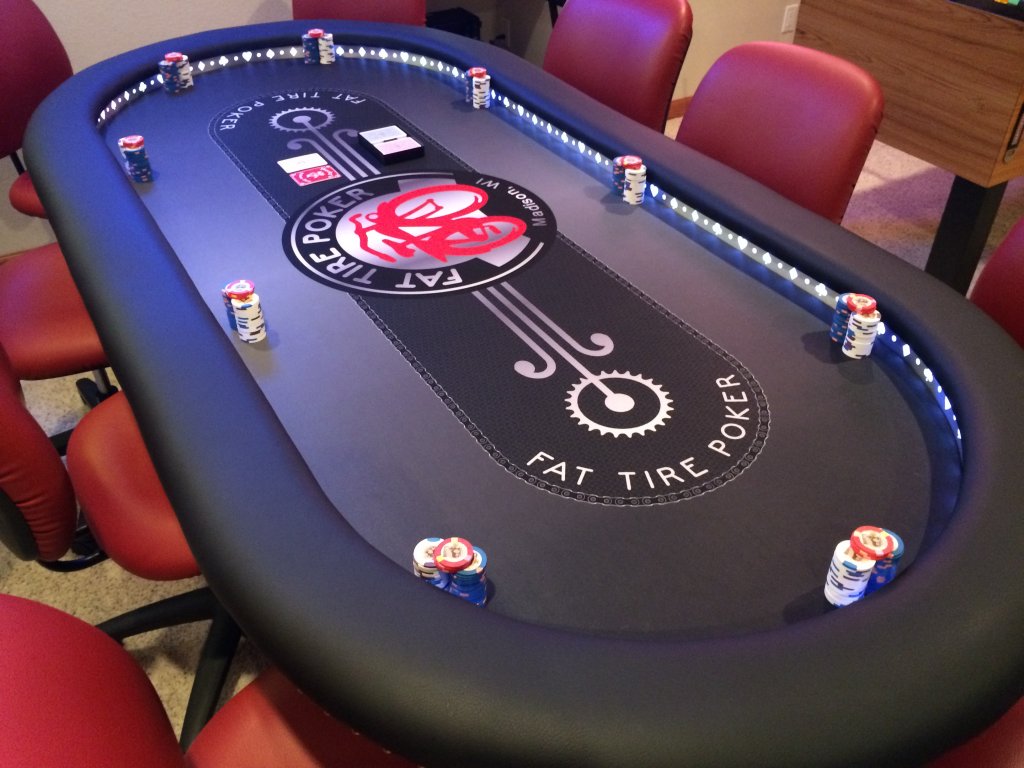
Thoughts on the logo (inside the betting line) facing the ends? Seems weird that it isn’t semetrical. If it’s facing the ends, it can be read (sideways) by all players. The way it’s currently is optioned, one player reads it facing them, and others have it sideways or upside down.
Here’s my table, with content facing the end.

Here’s my table, with content facing the end.

