PSA Not everyone's cup of tea but opinions welcomed (1 Viewer)

plain_sauce

Sitting Out
Joined
Jul 3, 2024
Messages
11
Reaction score
9
Location
San Diego
Hi All, while my main goal is to move away from my china clays and onto a custom fantasy set from cpc I know it takes as very very long time to finalize artwork wait for your inlay to be available etc etc not to mention the money. Anyways before I go off on a tangent I want to invest in a higher quality poker set that can also withstand having beer and chicken wing sauce without strenuous cleaning afterwards (i live in a frat house)
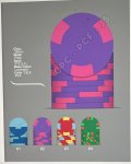
I’m planning on doing semi custom high roller valentino’s from BR Pro Poker done and I mocked up two designs that me and the people i play with are fond of. I know these non traditional colors and progressions are not everyone’s cup of tea but anyone willing to offer their opinion on which set looks the best would be doing me a huge favor to narrow my choice thanks! The demons we play with are 25c/$1/$/5/$20
 

Attachments

  • 2C0190E0-3FB8-4B8C-926E-22CA008699BE.jpeg
    2C0190E0-3FB8-4B8C-926E-22CA008699BE.jpeg
    106.9 KB · Views: 161
  • 04136CD0-BF56-4BD8-B7CA-22FB96E54EC2.jpeg
    04136CD0-BF56-4BD8-B7CA-22FB96E54EC2.jpeg
    104.2 KB · Views: 164
Unless you are planning chips with hot-stamps, you should use an inlay image with all of your mockups (even a temporary fill-in while your actual artwork is being designed).

Blank chips will always present and be perceived differently visually than chips with inlays, since so much more of the base color is hidden with inlays. This will not only change how a chip looks, but how it interacts with other chips in the set.

For example, a blank chip that presents significantly as a lavender chip (with pink 312 spots) will appear to be roughly 50/50 lavender/pink when displayed with an inlay (which will obscure much of the lavender base color).
 
If I "had" to choose one of these two. I would go with the second one. Neither of the mock ups make sense to me. Before you make any decisions I would do at least 500 mock ups using a variety of edge spots and base colors.
 
If I "had" to choose one of these two. I would go with the second one. Neither of the mock ups make sense to me. Before you make any decisions I would do at least 500 mock ups using a variety of edge spots and base colors.
Hi could you explain more on why they don’t make sense to you? The basis of my design was following semi traditional colors for option #2 with non traditional edge spots still with design progression.
 
Neither looks “friendly”. They are both kinda off putting, I can’t exactly say what but they don’t look like they are waiting for someone to pick them up and use them. They look cold and defensive. Not comfortable.

I think it’s the giant ass spots on them and then the $25 turns slim and classy. Start with thinner spots and progress to the 3/4 inch ones.
 
I agree with @detroitdad
Not sure if it’s for the same reasons but what doesn’t make sense to me is you go 2-color edge spots to 3-color edge spots and then back to 2-color again for the final two denoms.

Also, I’d expect the spot pattern on the 25 to get bigger/more complex to follow the logic of the pattern set by the others, but instead it goes the other way.
 
Neither looks “friendly”. They are both kinda off putting, I can’t exactly say what but they don’t look like they are waiting for someone to pick them up and use them. They look cold and defensive. Not comfortable.

I think it’s the giant ass spots on them and then the $25 turns slim and classy. Start with thinner spots and progress to the 3/4 inch ones.
Hi! Thank you and I totally see where you are coming from however I am just mocking up edge spot designs with the possible options I am given with the valentinos. I’m just experimenting with colors to be put on this semi custom set. If you had any suggestions on how to improve my design while also making them translate well to this template i would appreciate it thank you!
6545A148-FA62-4239-B6A3-457B4F15ED81.png
 
Hi could you explain more on why they don’t make sense to you? The basis of my design was following semi traditional colors for option #2 with non traditional edge spots still with design progression.

I really don't like anything about either mock up. I dislike most of the color choices. There isn't any flow whatsoever with the edge spot progression.
 
Definitely need to see with some sort of stand in logo to form an opinion

If your end goal is CPC I’m not sure you’ll be satisfied with semi custom. Maybe bite the bullet and do the CPC design and just get smooth ceramics off the rack for clean ability now. Or an ultrasonic cleaner for the china clays.
 

Create an account or login to comment

You must be a member in order to leave a comment

Create account

Create an account and join our community. It's easy!

Log in

Already have an account? Log in here.

Back
Top Bottom