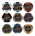
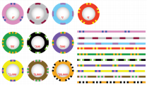
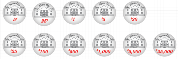
Inlay is absolutely quality and, assuming these are going to be ceramic chips, great to see someone use the full face of the chip for the design. Only worry would be the replication of white and yellow as base colours?Looking for some advice on this big fish collection I made. Edges would be solid colors with aligned edges with the top color rolling over.
-
This site contains affiliate links. If you choose to make a purchase after clicking a link, Poker Chip Forum may receive a commission at no additional cost to you. Thank you for your support!
You are using an out of date browser. It may not display this or other websites correctly.
You should upgrade or use an alternative browser.
You should upgrade or use an alternative browser.
Thread of Proofs // Add your custom chip proofs here (2 Viewers)
- Thread starter Puggy
- Start date
Nex
Flush
I'd have no issue with the font, it fits nicely, but what what makes me go "ugh" is the ".50" instead of "50¢".
RandomBrandon
Sitting Out
Thanks! Yes, these are ceramics so trying to utilize the entire face was the plan. I was thinking that about the white and yellow too but then thought the edges would really be the solid colors so stacked they would really pop off. essentially all the edges would be in order: Lime, white, red, blue, yellow, purple, black, teal, and hot pink.Inlay is absolutely quality and, assuming these are going to be ceramic chips, great to see someone use the full face of the chip for the design. Only worry would be the replication of white and yellow as base colours?
Appreciate the constructive feedback!
RandomBrandon
Sitting Out
Good call. might as well use the cents if I'm using the dollar sign. I'm actually not a huge fan of the $ in a lot of my other designs, which is why I use the . or the .50, but in this case it totally makes cents (sense). Good catch!I'd have no issue with the font, it fits nicely, but what what makes me go "ugh" is the ".50" instead of "50¢".
ngmcs8203
Flush
What about the sans serif you used for BIG?Thanks. Font is actually Reklame but does look similar to Marker. Wanted to find something similar to the Fish font without it being script and too hard to read. I'll look for some other font options.
RandomBrandon
Sitting Out
I gave that a shot but it looked too thin. Maybe I’ll offset the path and make it thicker/bolder since that typeface does have a bold option. Appreciate the suggestion!What about the sans serif you used for BIG?
So, just to confirm, the actual circular sides of the chips are going to be solid colours?Thanks! Yes, these are ceramics so trying to utilize the entire face was the plan. I was thinking that about the white and yellow too but then thought the edges would really be the solid colors so stacked they would really pop off. essentially all the edges would be in order: Lime, white, red, blue, yellow, purple, black, teal, and hot pink.
Appreciate the constructive feedback!
I like the font and the chip overall. Well doneThanks. Font is actually Reklame but does look similar to Marker. Wanted to find something similar to the Fish font without it being script and too hard to read. I'll look for some other font options.
RandomBrandon
Sitting Out
So, just to confirm, the actual circular sides of the chips are going to be solid colours?
That’s the thought right now. I’ll do some circles or small lines but the bulk would be the identifying colors.
I should have read your OP properly, in hindsight, my bad, hahah!That’s the thought right now. I’ll do some circles or small lines but the bulk would be the identifying colors.
improviseallday
Flush
Btw mocks usually go in this thread: https://www.pokerchipforum.com/threads/post-mockups-for-fun-science.8283/Looking for some advice on this big fish collection I made. Edges would be solid colors with aligned edges with the top color rolling over.
Really like the artwork and font.
Few things to consider:
- BR Pro's black IMO is a dark gray. Recommending ordering some samples to see the colors.
- $500 and $25k would be hard for some colorblind folks to distinguish.
- Consider dropping the comma from 1k and 5k.
Quicksilver-75
4 of a Kind
Without reading all the way back...BR Pro's black IMO is a dark gray.
When you use black for ceramic applications, what CMYK value do you use?
improviseallday
Flush
This is based on theWithout reading all the way back...
When you use black for ceramic applications, what CMYK value do you use?
EDIT: Upon re-examining my samples, I think the Tiki Kings are intentionally a dark gray.
Last edited:
Quicksilver-75
4 of a Kind
I almost always use 50/50/50/100 for black. That's why I asked. The graying that I've noticed is usually an issue with the edges and a lack of pressure to have the pigment really penetrate the chip.
RandomBrandon
Sitting Out
I make my own chips and typically use 100/100/100/100 if I’m flooding the color. If I have to do detail or small line then I’ll use 50/50/50/100 to ensure the lines don’t bleed.Btw mocks usually go in this thread: https://www.pokerchipforum.com/threads/post-mockups-for-fun-science.8283/
Really like the artwork and font.
Few things to consider:
- BR Pro's black IMO is a dark gray. Recommending ordering some samples to see the colors.
- $500 and $25k would be hard for some colorblind folks to distinguish.
- Consider dropping the comma from 1k and 5k.
chipinla
Straight Flush
- Joined
- Apr 12, 2018
- Messages
- 8,199
- Reaction score
- 23,324
Interesting that the most personal chip you designed is going on ceramic
improviseallday
Flush
Loving a lot about this chip. The roughened spots, the large denom, the home-y font, the big swooping S, that sunflower.
Maybe I need new glasses but I find the "There's No Place Like Home" text hard to read because of its size.
Have you tried nudging the 25¢ text left a little?
chipinla
Straight Flush
- Joined
- Apr 12, 2018
- Messages
- 8,199
- Reaction score
- 23,324
FYI, Just because it has my name on it doesn’t necessarily mean it’s the most personal.Interesting that the most personal chip you designed is going on ceramic
improviseallday
Flush
I need to learn my chip history heh. Thanks for sharing
Totally fair, my mistake.FYI, Just because it has my name on it doesn’t necessarily mean it’s the most personal.
Aegean Phare, on the Meander ("new Greek") mold.

Combining colors for the sea, waves, sky, sun, sunset and springtime wildflowers.
Profound thanks to @mattross1313
Combining colors for the sea, waves, sky, sun, sunset and springtime wildflowers.
Profound thanks to @mattross1313
RandomBrandon
Sitting Out
Littleluck55
Flush
Upper denoms added.
MichaelBubly
Flush
Messing around with a Mint tournament set. Not sure how I feel about it at this point. Inlay needs some work and I'm a little iffy on the spots and colors so far.

davislane
Straight Flush
- Joined
- Jul 12, 2020
- Messages
- 9,999
- Reaction score
- 14,698
can we see the lower denoms?
NVFlip
Two Pair
WHOAH. I'm a fan. I'm working on a cash set that uses the Philippines currency colors. I'm still deciding on the inlay. Did these ever see the light of day? If so could you post pics?My cash game set. Not as fancy as the ones before me but this will get lots of playtime with my friends. Working on much better View attachment 159206 themed inlays for my next order.
deeoohhgee
High Hand
here's a trial at a sort of Matsui-esque design ... yes i know the denoms need work (there's a much deeper story there related to the fact that 2 of our regular players are color blind so was just needing something that kind of plain that really stands out), and i left off the inlay logo. i'm thinking i would would attempt something like this on a set of hybrid scrowns or hybrid plains ... i was also thinking of adding a border to the inlay, in the edge spot color just to accentuate that.
Attachments
deeoohhgee
High Hand
alright here are the inlays:here's a trial at a sort of Matsui-esque design ... yes i know the denoms need work (there's a much deeper story there related to the fact that 2 of our regular players are color blind so was just needing something that kind of plain that really stands out), and i left off the inlay logo. i'm thinking i would would attempt something like this on a set of hybrid scrowns or hybrid plains ... i was also thinking of adding a border to the inlay, in the edge spot color just to accentuate that.
Attachments
Similar threads
- Replies
- 3
- Views
- 275
- Locked
- Replies
- 66
- Views
- 3K
- Locked
- Replies
- 28
- Views
- 1K
- Replies
- 16
- Views
- 492


