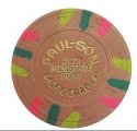
Windwalker’s Chipping Journey in Pr0n0grAph1C Detail (28 Viewers)

I’ve spent a significant portion of my chipping time trying to make my Binion’s WSOP Paulson’s set playable for a multi-table tourney, but the issue has always been the extremely low number of T500s and T5000s available. While I did succeed is getting some of each, they were definitely not enough to make a fully playable set for multiple tables. I needed at least 3 racks of T500 and 2 racks of T5000 chips.

So, the hunt began for suitable replacements. I was committed to finding chips that had the same spot patterns as the originals, but also fit the color story of the set. Much thanks to @Gear for his insanely amazing help and work along this journey.

Here are the results:

BvgMUEH.jpg

bIqLR3J.jpg
 
I’ve spent a significant portion of my chipping time trying to make my Binion’s WSOP Paulson’s set playable for a multi-table tourney, but the issue has always been the extremely low number of T500s and T5000s available. While I did succeed is getting some of each, they were definitely not enough to make a fully playable set for multiple tables. I needed at least 3 racks of T500 and 2 racks of T5000 chips.

So, the hunt began for suitable replacements. I was committed to finding chips that had the same spot patterns as the originals, but also fit the color story of the set. Much thanks to @Gear for his insanely amazing help and work along this journey.

Here are the results:

BvgMUEH.jpg

bIqLR3J.jpg
Please go ahead and inject this splash pot photo directly into my veins.
 
I’ve spent a significant portion of my chipping time trying to make my Binion’s WSOP Paulson’s set playable for a multi-table tourney, but the issue has always been the extremely low number of T500s and T5000s available. While I did succeed is getting some of each, they were definitely not enough to make a fully playable set for multiple tables. I needed at least 3 racks of T500 and 2 racks of T5000 chips.

So, the hunt began for suitable replacements. I was committed to finding chips that had the same spot patterns as the originals, but also fit the color story of the set. Much thanks to @Gear for his insanely amazing help and work along this journey.

Here are the results:

BvgMUEH.jpg

bIqLR3J.jpg
Looks nice. If you don't need those originals anymore I'll take em off your hands
 
I’ve spent a significant portion of my chipping time trying to make my Binion’s WSOP Paulson’s set playable for a multi-table tourney, but the issue has always been the extremely low number of T500s and T5000s available. While I did succeed is getting some of each, they were definitely not enough to make a fully playable set for multiple tables. I needed at least 3 racks of T500 and 2 racks of T5000 chips.

So, the hunt began for suitable replacements. I was committed to finding chips that had the same spot patterns as the originals, but also fit the color story of the set. Much thanks to @Gear for his insanely amazing help and work along this journey.

Here are the results:

BvgMUEH.jpg

bIqLR3J.jpg
BUT I LIKE THE 500s!
 
I’ve spent a significant portion of my chipping time trying to make my Binion’s WSOP Paulson’s set playable for a multi-table tourney, but the issue has always been the extremely low number of T500s and T5000s available. While I did succeed is getting some of each, they were definitely not enough to make a fully playable set for multiple tables. I needed at least 3 racks of T500 and 2 racks of T5000 chips.

So, the hunt began for suitable replacements. I was committed to finding chips that had the same spot patterns as the originals, but also fit the color story of the set. Much thanks to @Gear for his insanely amazing help and work along this journey.

Here are the results:

BvgMUEH.jpg

bIqLR3J.jpg
I never noticed this before and I thought it was a product of your T500s and T5000s being relabels, but then I also noticed it on your T1000s (of which I own exactly zero myself), which if I'm not mistaken are original. What I noticed is that the font on the denom for T500 and up, looks just slightly different than the denom font on the T100 and under. It looks like T500, T1000, T5000 are all sans-serif and T1, T5, T25 and T100 are serif as well as a tad heavier/thicker.

I wonder maybe they did this because of spacing considerations on the inlay, but the T100 and T500 should be about the same space-wise, and they're different fonts.
 
I’ve spent a significant portion of my chipping time trying to make my Binion’s WSOP Paulson’s set playable for a multi-table tourney, but the issue has always been the extremely low number of T500s and T5000s available. While I did succeed is getting some of each, they were definitely not enough to make a fully playable set for multiple tables. I needed at least 3 racks of T500 and 2 racks of T5000 chips.

So, the hunt began for suitable replacements. I was committed to finding chips that had the same spot patterns as the originals, but also fit the color story of the set. Much thanks to @Gear for his insanely amazing help and work along this journey.

Here are the results:

BvgMUEH.jpg

bIqLR3J.jpg

These turned out great! That 8V Olympic chip is a beauty.
 
I never noticed this before and I thought it was a product of your T500s and T5000s being relabels, but then I also noticed it on your T1000s (of which I own exactly zero myself), which if I'm not mistaken are original. What I noticed is that the font on the denom for T500 and up, looks just slightly different than the denom font on the T100 and under. It looks like T500, T1000, T5000 are all sans-serif and T1, T5, T25 and T100 are serif as well as a tad heavier/thicker.

I wonder maybe they did this because of spacing considerations on the inlay, but the T100 and T500 should be about the same space-wise, and they're different fonts.
The original T500 is also san serif’ed, and I think that may be the case because they were produced in different batches. The T1000 is definitely San Serif’ed as is the original T5000.
 
The original T500 is also san serif’ed, and I think that may be the case because they were produced in different batches. The T1000 is definitely San Serif’ed as is the original T5000.
Yep. So do you think it's just because of being made in different batches or is it a space thing on the inlay?
 
Yep. So do you think it's just because of being made in different batches or is it a space thing on the inlay?
I honestly don’t know. I think space is a definite consideration, but I’d also wager that different graphic designers created different mock-ups. I don’t think they cared about uniformity as much as we do — they probably just picked a font that looked similar, and the designer made a decision to use a font where the smallish kerning wouldn’t affect readability.
 
Latest iteration, far from complete:

LTWUd7i.png
I like the hundo a lot. With that inlay, coloring, that's a great looking chip.

The use of the colored denoms is nice, but doesn't seem to be consistent throughout, seems like issues getting them to show up?

Shaped inlays are cool, but I don't know that they are bringing anything to this set, maybe just use the same shape throughout. COG/SCA/HUB look best.

Aside from the blue you aren't really using primary colors and it definitely gives an overall look. The color limiting is causing me to group the 5/25/500/1000 together in my mind and exclude the 1. The 100 and 5000 seem like they are off in their own world too.

1. The inlay is changing to a full white background / retro inlay with a colored denom - (Like the Bourbon Street inlay.) The reason the colors don't match is because the inlay designs are old, attached to a different chipset.

2. Love the suggestion of a single shape -- was curious if that would look "unprogressive".

3. The colors on the 500 and the 5000 aren't right yet, from my perspective. Lots of work to do!
 
2. Love the suggestion of a single shape -- was curious if that would look "unprogressive".
When playing around with the design tool I always try to match a shape where possible so that it best "interacts" with the spot pattern. i.e. for the $1 or $5, I would be inclined to use the tri-moon shape or something that is "uniform" like hub, sca or cog.

An example of one of my mockups where I have tried to match the inlay shape to the spot pattern.

version 3.9e.png
 
When playing around with the design tool I always try to match a shape where possible so that it best "interacts" with the spot pattern. i.e. for the $1 or $5, I would be inclined to use the tri-moon shape or something that is "uniform" like hub, sca or cog.

An example of one of my mockups where I have tried to match the inlay shape to the spot pattern.

View attachment 753270
can CPC line up inlays with the edgespots? that seems like a ton of coordination and alignment to get right.
 
can CPC line up inlays with the edgespots? that seems like a ton of coordination and alignment to get right.
:unsure:. Excellent question. I've never asked them directly myself, but from what I've read I believe they can/do. There are also examples of Paulson that are inlay aligned. Isle Cape Girardeau come to mind as an example.
 

Create an account or login to comment

You must be a member in order to leave a comment

Create account

Create an account and join our community. It's easy!

Log in

Already have an account? Log in here.

Back
Top Bottom