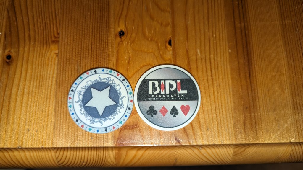
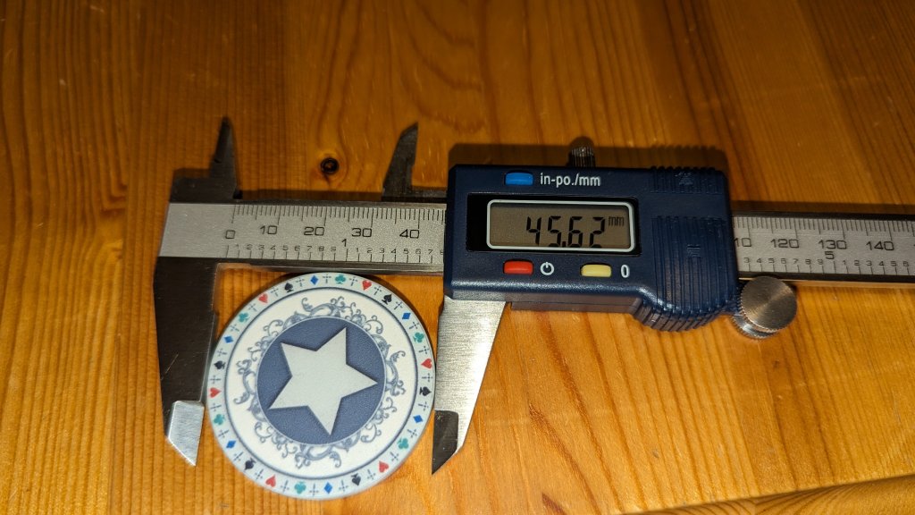
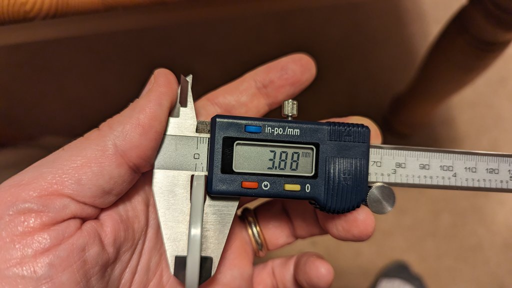
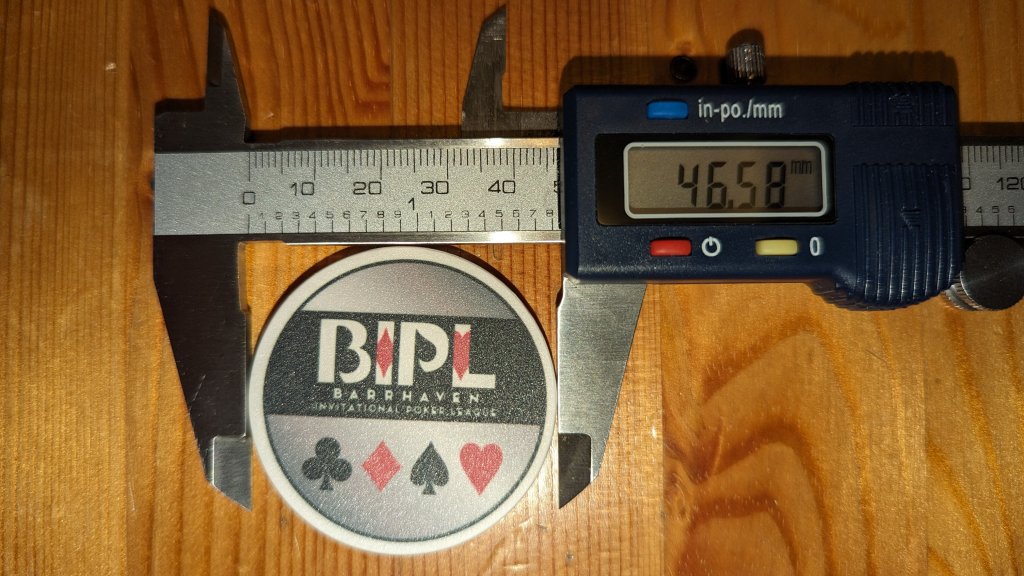
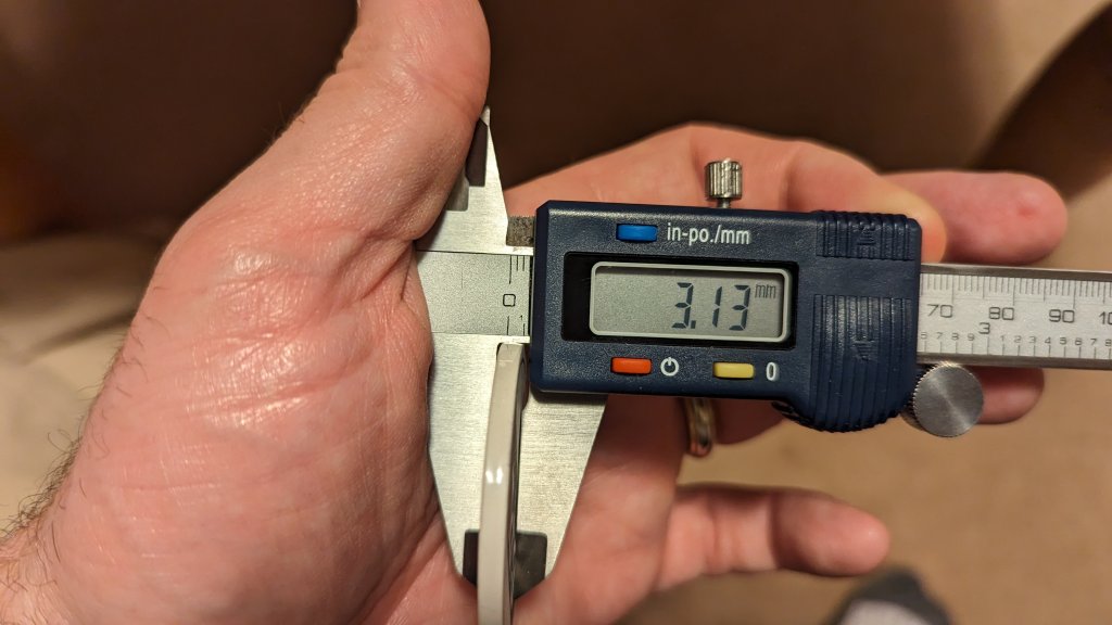
The Old West seating chips were 46mm and were thicker than BR Pro Poker's current offerings. To my knowledge, those blanks are not available for use. Which is too bad, as I would have gladly used them if they were an option for the seating chips I had made for our league (I used the BR Pro Poker 47mm chips). I've included pictures of the measurements for both.
You are using an out of date browser. It may not display this or other websites correctly.
You should upgrade or use an alternative browser.
You should upgrade or use an alternative browser.
GB Completed 8-Table Seating Chips and Dealer Buttons (1 Viewer)
- Thread starter GreekRedEye
- Start date
- Status
- Not open for further replies.
The Old West seating chips were 46mm and were thicker than BR Pro Poker's current offerings. To my knowledge, those blanks are not available for use. Which is too bad, as I would have gladly used them if they were an option for the seating chips I had made for our league (I used the BR Pro Poker 47mm chips). I've included pictures of the measurements for both.
View attachment 1214570
View attachment 1214571View attachment 1214573
View attachment 1214572
View attachment 1214574
Thank you, very helpful. Making the seating chips 47mm would bump up the cost about 30c a chip, but is a possibility. When I order the prototypes, I may do some in 43mm and a some in 47mm to see the difference.
Bump for proofreading / design suggestions. Please send me any suggestions before midnight tonight.
Prototype order goes in tomorrow.
I fixed the missing gradient for blue seat 4 and added a line under the 9.
Prototype order goes in tomorrow.
I fixed the missing gradient for blue seat 4 and added a line under the 9.
Tony_M
Two Pair
Love all of this. In for the Royals set and I like the rainbow dealer button too if that flies.
Is it just me or are the numbers really hard to read? (And I have good vision) Design is cool but I feel the number is the most important part and should stand out.
ngmcs8203
Flush
I’m wondering if the stroke on the numbers is set to be inside and not on the outside of the character.Is it just me or are the numbers really hard to read? (And I have good vision) Design is cool but I feel the number is the most important part and should stand out.
Is it the stroke, the font, or the busy background that is the problem?Is it just me or are the numbers really hard to read? (And I have good vision) Design is cool but I feel the number is the most important part and should stand out.
I will double check the stroke tonight. I can also try adding a bit of a drop shadow to see if that helps.I’m wondering if the stroke on the numbers is set to be inside and not on the outside of the character.
I will get a rainbow prototype. If we did a rainbow joker then I would probably make the king an orangish yellow as I fear red, orange, yellow, brown may all be too close. But we will know better once we have prototypes.I like the rainbow dealer button too if that flies.
You guys were right. The stroke was in the middle and when I moved it to the outside, it improved legibility. I also bumped the stroke thickness up a bit and rounded the stroke. I think the numbers pop better now. I tried a drop shadow, but I axed it...I think it made things busier and less clear.
The font size on the center numbers are 60 points...so they will be BIG.
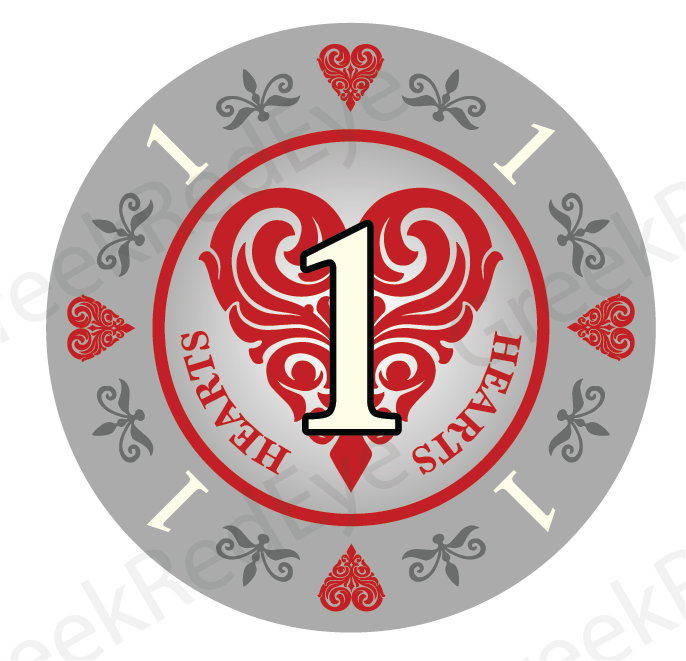
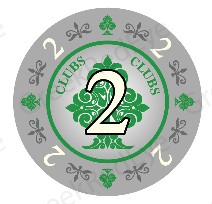
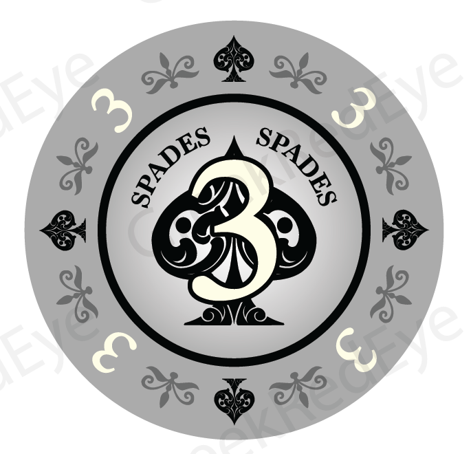
I also think the previous graphic I posted, zoomed out and with a stronger water mark might have affected readability. Here are 3 examples zoomed in and with the watermark turned down as low as possible.
The font size on the center numbers are 60 points...so they will be BIG.
I also think the previous graphic I posted, zoomed out and with a stronger water mark might have affected readability. Here are 3 examples zoomed in and with the watermark turned down as low as possible.
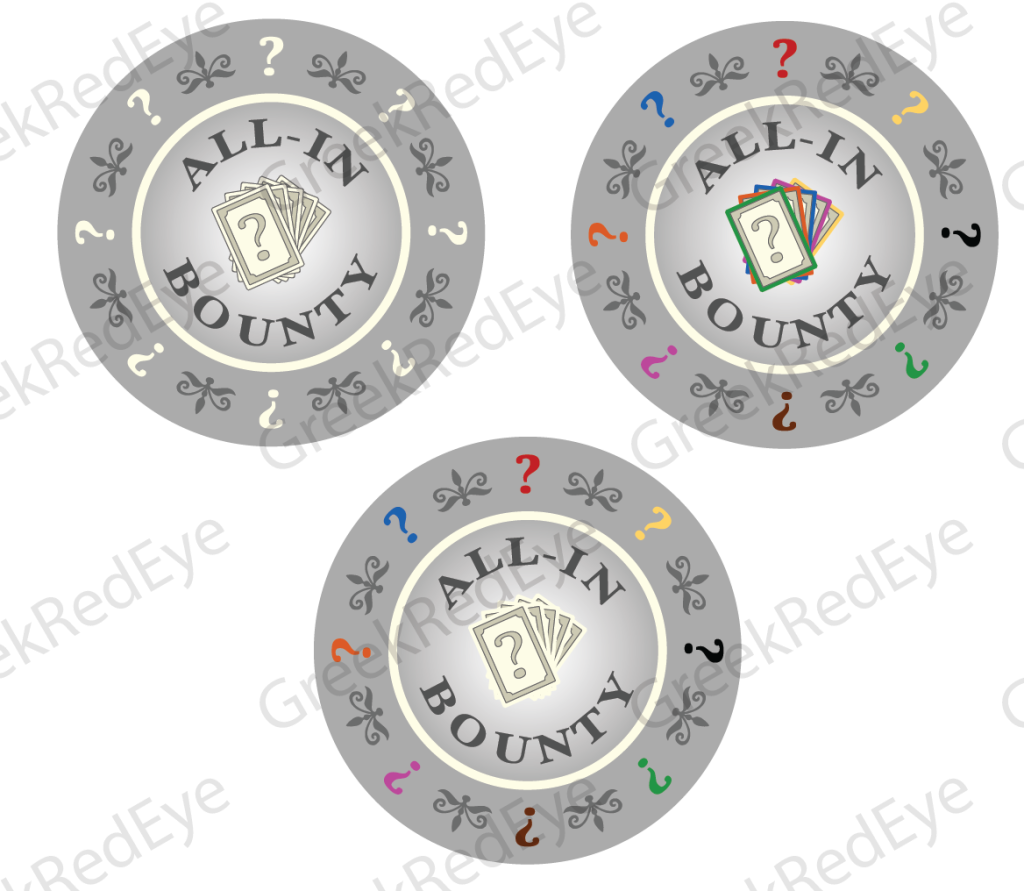
Also, I would like some feedback on the common side of the seating chips. As every chip will have this graphic, it might be the most important one. Here is a grayscale and a couple color options.
Forty4
Full House
Should the outer number have an outline?
For a couple prototypes I outlined the outer ring numbers to see how it compares. Good suggestion!Should the outer number have an outline?
The prototype file is off to BR Pro Poker!
Tony_M
Two Pair
Personally, I like the top right with the multi-colors for the common side.
I am prototyping both the boring grey and the colorful version.Personally, I like the top right with the multi-colors for the common side.
I think boring grey will look better with more sets, but either way Ill be purchasing a full set of these, thanks for doing the legwork.
Personally, the multiple cards on the all-in side doesnt do it for me. Hmmm cash? Money sign? Dont know. Just spitballin.
Personally, the multiple cards on the all-in side doesnt do it for me. Hmmm cash? Money sign? Dont know. Just spitballin.
I think boring grey will look better with more sets, but either way Ill be purchasing a full set of these, thanks for doing the legwork.
Personally, the multiple cards on the all-in side doesnt do it for me. Hmmm cash? Money sign? Dont know. Just spitballin.
Like this? Any other ideas? I can probably still update the file with Br Pro Poker to include a prototype of different designs.
Love the money bag and $Like this? Any other ideas? I can probably still update the file with Br Pro Poker to include a prototype of different designs.
View attachment 1216160
Great job! Personally I like the moneybags. Dont mean to be demanding, love the work you're doing.
Great job! Personally I like the moneybags. Dont mean to be demanding, love the work you're doing.
Love the money bag and $
Feedback is helpful!
Maybe a little color to the gray.... One color? Not the multi color prototype. Just one 'subtle' shade to make it stand out a little bit moreFeedback is helpful!
Just an idea.
I'm buying these no matter what...
Last edited:
Sparkynutz
Flush
Money bag is my favorite too.
I received the first round of prototypes! I have to say BR Pro Poker and Kristil specifically are a pleasure to deal with!
I am pleased with the prototypes although there are still some improvements to be made before we finalize the design and move this to "taking orders" status. I probably should wait till I have sunlight to take good photos, but I want to get these out to the group as soon as possible. The prototypes tried a few things out - so some of the inconsistencies like a stroke on one design but not another were (probably) intentional.
My initial thoughts:
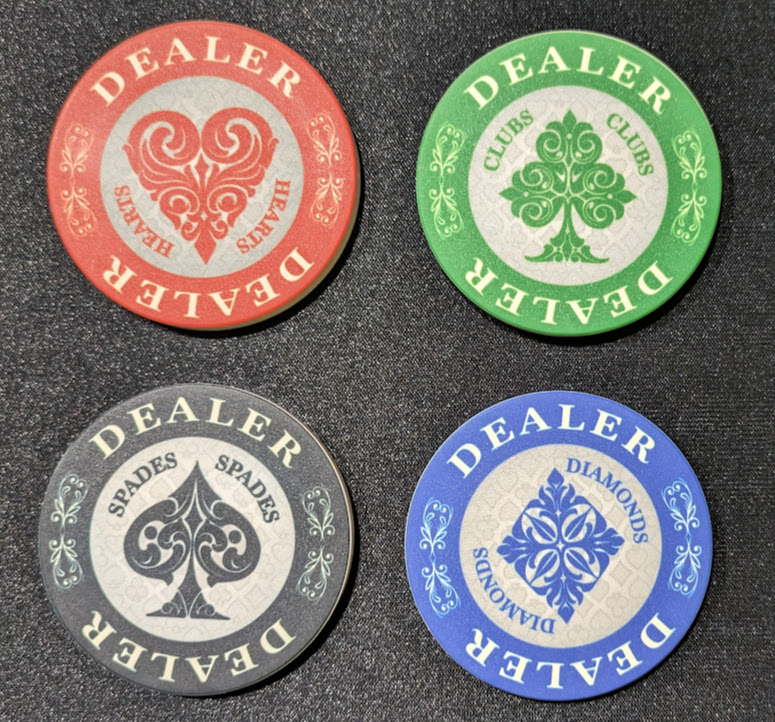
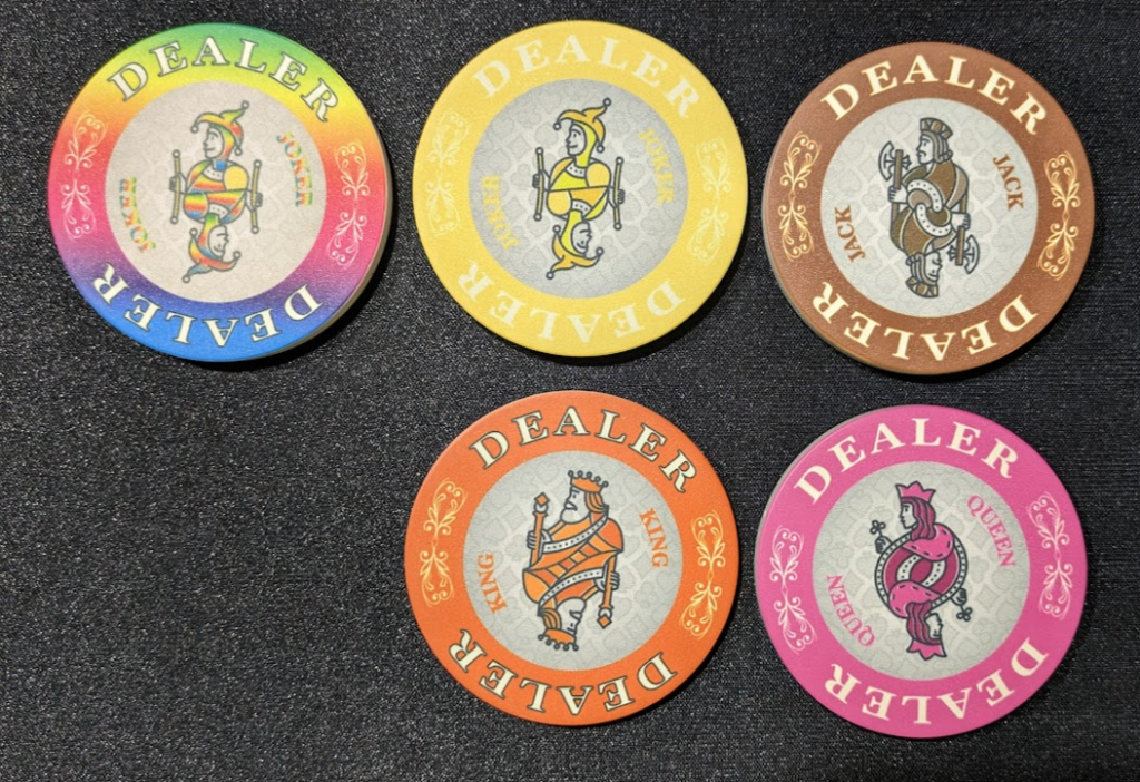
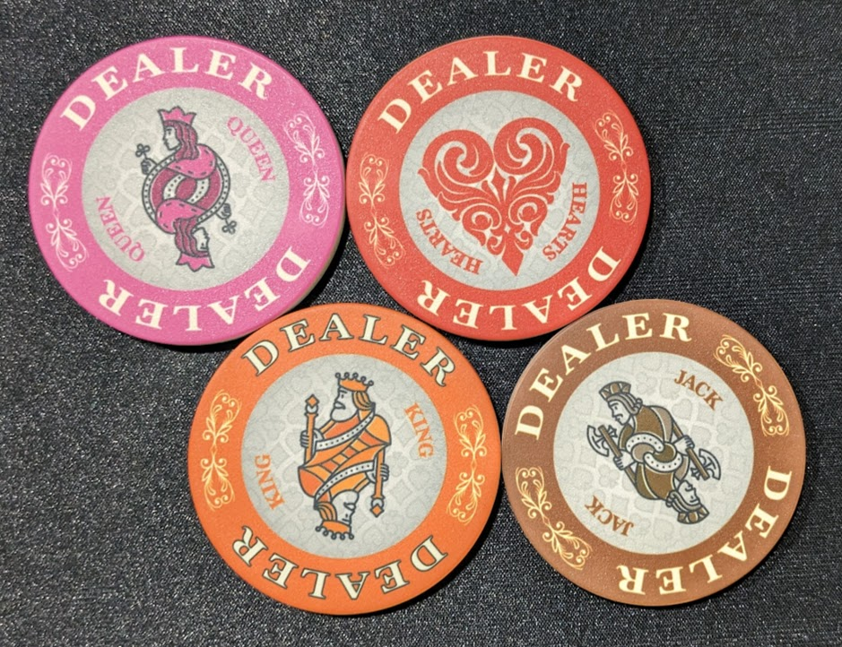
Number 9 and 10 are 47mm
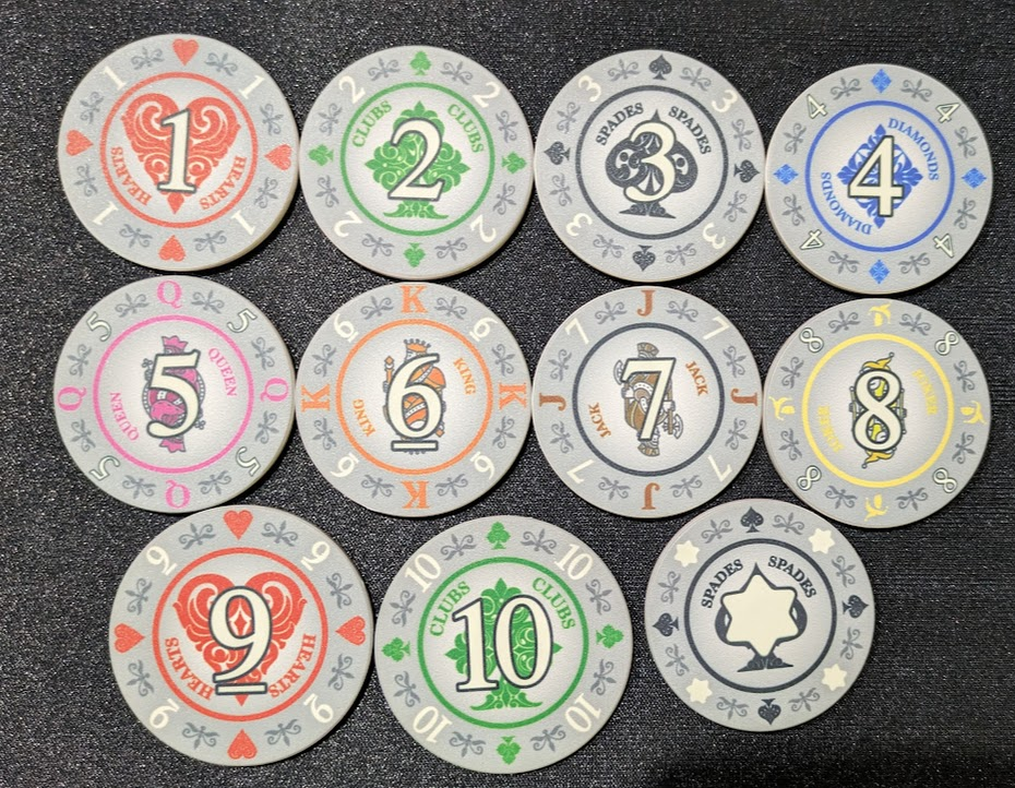
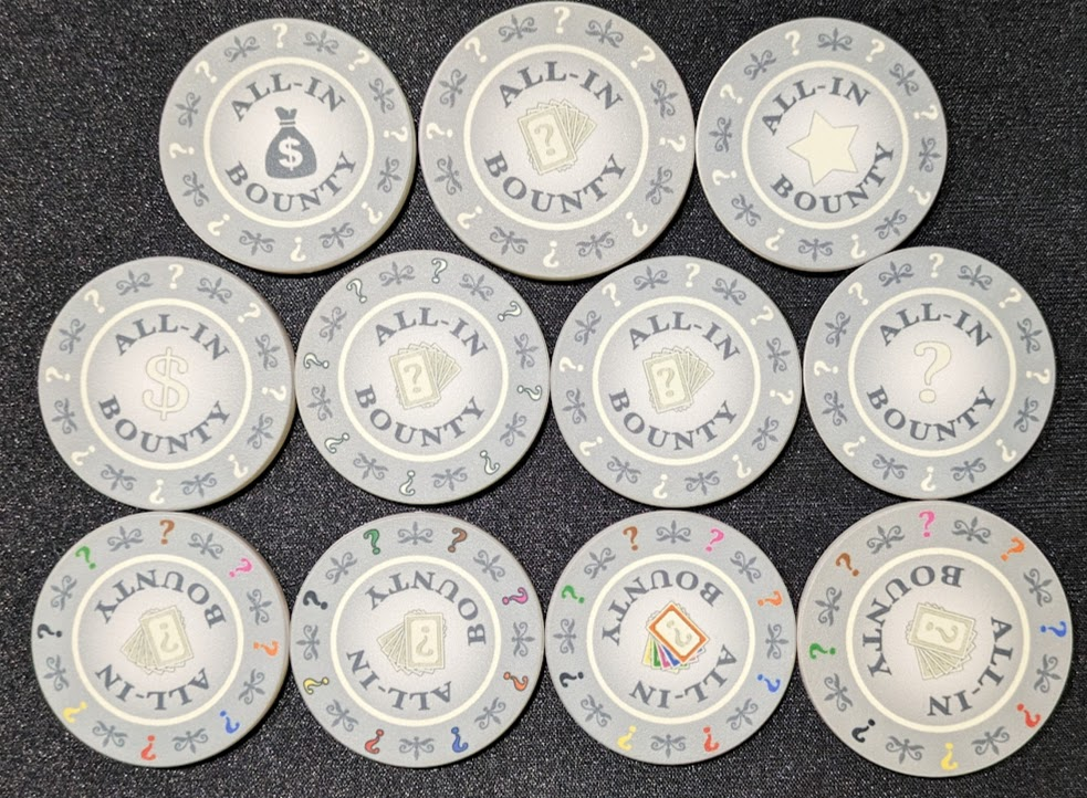
I am pleased with the prototypes although there are still some improvements to be made before we finalize the design and move this to "taking orders" status. I probably should wait till I have sunlight to take good photos, but I want to get these out to the group as soon as possible. The prototypes tried a few things out - so some of the inconsistencies like a stroke on one design but not another were (probably) intentional.
My initial thoughts:
- Would anyone in the DC area like to meet up this week to look at these in person and give me their thoughts? PM me.
- 60mm dealer buttons and 47mm seating chips are definitely the way to go. Bigger is better!
- The pink is a bit too close to the red. I think I can move the pink more toward purple and it will work.
- I prefer to not stroke the word "dealer" but if we keep yellow I think it will be necessary - or maybe we use grey color for word "dealer" on yellow.
- I kind of like rainbow joker - but the word joker should be made dark grey or black to be more readable.
- We can bump up the size of the words "King" and "Clubs" etc. to make them a bit more readable. Maybe stroke them too.
- I prefer all grey for the "boring" common side over the versions with color.
Number 9 and 10 are 47mm
Looks great and the tweaks you are talking about are good too
JoeyMack
Flush
These are awesome! Nice work @GreekRedEye !
I like the smaller numbers with the outlines and the money bag. I think the white ?s on the bounty’s are too dull and the rainbow too busy. Maybe do the ? In black (like your original design) or at least outline them like you did the numbers. Either way I’m down for the whole kit and caboodle.
I like the smaller numbers with the outlines and the money bag. I think the white ?s on the bounty’s are too dull and the rainbow too busy. Maybe do the ? In black (like your original design) or at least outline them like you did the numbers. Either way I’m down for the whole kit and caboodle.
These are awesome! Nice work @GreekRedEye !
I like the smaller numbers with the outlines and the money bag. I think the white ?s on the bounty’s are too dull and the rainbow too busy. Maybe do the ? In black (like your original design) or at least outline them like you did the numbers. Either way I’m down for the whole kit and caboodle.
Thanks!
I agree with all points. I will outline the small numbers on rim like #4 and #8.
The moneybag looks great in person.
I did try outlining the question mark (see the version south-east from the money-bag). It does not look good. I think, though, just making the question mark fill he same grey as the moneybag will work. Or maybe I need to darken the stroke. I will try both.
I will order a couple more prototypes of pinks, reds, yellows next week. I think we can start collecting orders concurrently though.
This weekend I will update both the design and move us to the taking order step. If anyone has design change suggestions, now is the time to ask.
Tony_M
Two Pair
I'm in agreement with what's already been said. I think they look GREAT!!! Awesome work
My one question is on the Bounty/All-In side .... will there be options for which one we want or are you going to settle on one design for all? If I had to rank them I think I would go with (favorite - least favorite): Moneybag, Cards, Dollar Sign, Question Mark, Star. I like the color for the question marks along the outside rim but as you see them in person you know best what actually looks better. Regardless what you decide I'm in for a set and am eager to get themin my grubby little hands on my poker table. 
My one question is on the Bounty/All-In side .... will there be options for which one we want or are you going to settle on one design for all? If I had to rank them I think I would go with (favorite - least favorite): Moneybag, Cards, Dollar Sign, Question Mark, Star. I like the color for the question marks along the outside rim but as you see them in person you know best what actually looks better. Regardless what you decide I'm in for a set and am eager to get them
Because of order minimums, we will standardize the back. Will be in all grey and not colors. In person I think the grey looks better. Showed them to wife and teenager and they were confused by colors on backside, "wait, which color table is this for?" Once they saw the all grey version they preferred it.I'm in agreement with what's already been said. I think they look GREAT!!! Awesome work
My one question is on the Bounty/All-In side .... will there be options for which one we want or are you going to settle on one design for all? If I had to rank them I think I would go with (favorite - least favorite): Moneybag, Cards, Dollar Sign, Question Mark, Star. I like the color for the question marks along the outside rim but as you see them in person you know best what actually looks better. Regardless what you decide I'm in for a set and am eager to get themin my grubby little handson my poker table.
Consensus seems to be moneybag is best icon for the back.
JoeyMack
Flush
Ah-ha! Totally missed that one. I don’t think it looks bad, but maybe a little busy. You have them in front of you so I’ll definitely take your word if it looks good or not.I did try outlining the question mark (see the version south-east from the money-bag). It does not look good.
And just realized that if people are only getting a half set then all the colors definitely wouldn’t make sense. My only thoughts about sprucing it up is maybe adding another color that you haven’t yet used yet or maybe even do the rainbow band like that one joker dealer button. Or maybe just making the money bag tannish. I don’t know…it’s just the dealer buttons and the seating sides are just so vibrant the lack of color that reverse side just feels a little blah.Showed them to wife and teenager and they were confused by colors on backside, "wait, which color table is this for?" Once they saw the all grey version they preferred it.
Here are the second (and I think last) round of prototypes I will send to BR Pro Poker. Trying 3 different colors of pink/purple. Trying some different strokes. I enlarged texts.
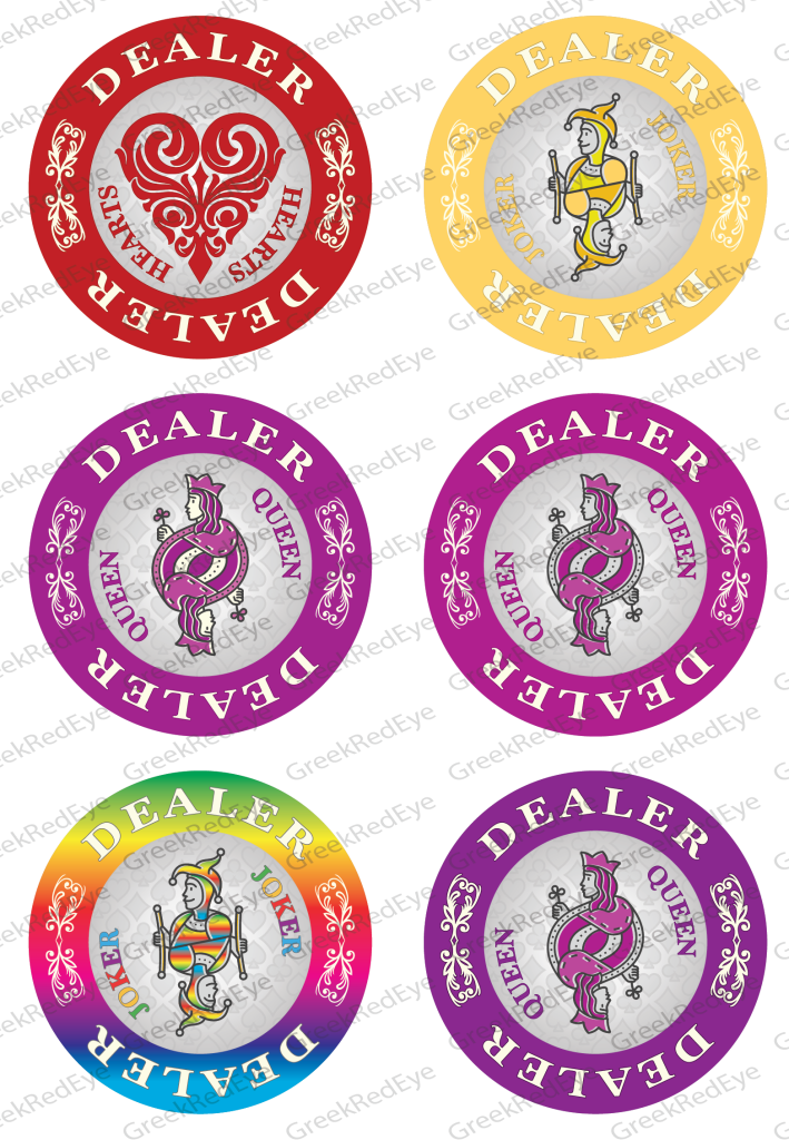
On the seating chips, I think killing the "?" altogether is the way to go. Trying some different things out, including #4 with darker grey, fewer objects around the ring, some muted colors for the bounty side.

On the seating chips, I think killing the "?" altogether is the way to go. Trying some different things out, including #4 with darker grey, fewer objects around the ring, some muted colors for the bounty side.
- Status
- Not open for further replies.
Similar threads
- Replies
- 48
- Views
- 3K
- Replies
- 120
- Views
- 7K
- Locked
- Replies
- 53
- Views
- 3K
- Locked
- Replies
- 20
- Views
- 1K
- Replies
- 49
- Views
- 4K
