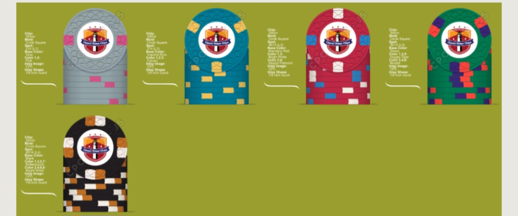
Huskerchipper
Flush
I like this one the best but I can guarantee another member will like your last mockup better. Go with what speaks for YOU.

Not in love with that hundo… not sure why, but it feels out of placeI think I'm getting close. I'm going to start working on my inlay and then see how I like it with them.
View attachment 1294241
I had the EXACT same thought....Not in love with that hundo… not sure why, but it feels out of place
I have an alternate. I was looking toward avoiding a duplicate spot pattern. I'm also not sure about the dayglo yellow on the 25 since I'm using that on the 1.Not in love with that hundo… not sure why, but it feels out of place
I like it alot better tbh. I would want to see that with the Green being a 4D14. We are going to just drive you nutz... Your happiness is all that matters and my opinion might be garbage.I have an alternate. I was looking toward avoiding a duplicate spot pattern. I'm also not sure about the dayglo yellow on the 25 since I'm using that on the 1.
View attachment 1294401
I like it alot better tbh. I would want to see that with the Green being a 4D14. We are going to just drive you nutz... Your happiness is all that matters and my opinion might be garbage.
Make your $25 3DS16. Won’t be tri colored but it gives you a different spot patternI have an alternate. I was looking toward avoiding a duplicate spot pattern. I'm also not sure about the dayglo yellow on the 25 since I'm using that on the 1.
View attachment 1294401
I like it and in my eyes the spot progression would look good and make sense with the latest Black that you mocked up
It’s too white, infinity is a long time it should be aged, what if the symbol in the club was stone that was crumbling or falling apart? Or the denom?
Agree with Machine- I would drop the white on either the $5 or $25. I’d also consider replacing blue on either the $5 or $100. To keep it simple, I’d look for another set of spot colors on the $5.As usual I'm still completely up in the air on the $25 and $100 chip, but I feel like I'm dialing it in. I think the $25 spots are my last choice. Famous last words
View attachment 1331076
View attachment 1331077
It’s too white, infinity is a long time it should be aged, what if the symbol in the club was stone that was crumbling or falling apart? Or the denom?
Another direction could be take the logo below the 100 remove the smaller club and do larger denoms like a hustler chip, keeping the background club as is?
For my tastes....thats a drastic improvement! Alot to like there.Made some big changes. Still fiddling with the base color on the frac and the spots on the 25. I was avoiding unweighted base colors, but after some research on here found most people don't really notice a difference.
View attachment 1347553
I love the white and lavender... but I would have Lavender be the base color and white as the edge spot for a fracAny thoughts/feedback on these fracs?
View attachment 1361753
I thought the lavender and blue might be a bit too close for side by side denoms.I love the white and lavender... but I would have Lavender be the base color and white as the edge spot for a frac
