CPC Cash Set and Tourney Set Colors and Edge Spot Help (2 Viewers)

Timmah

Straight
Supporter
Joined
Sep 6, 2023
Messages
889
Reaction score
1,701
Location
Indiana
So I received my CPC sample color set yesterday and I went and tweaked my colors and edge spots. It’s amazing how much different the colors are in real life vs the design tool. I haven’t designed the inlays. I wanted to get the chip colors down first.

Cash Set
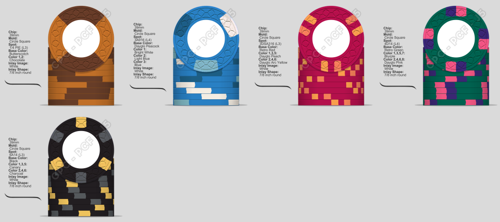
IMG_2674.png


Fracs, $1, $5, $25, $100

Tourney Set
IMG_2675.png


100, 500, 1000, 5000

Any input is appreciated in regards to the colors and edge spot progressions.

 
Have you tried the samples in dark lighting? Cash set in particular seems quite dark.

I’m rather colorblind so take with a grain of salt but I think $25 level of contrast feels different from other chips.

T500 is nice. Though it feels a bit different vibe from the others. A bit weird to me to go down to only 2 total colors on T1000.

General point, I suggest pausing at some point and spending time in the inlay side of things. IMO most of the best CPC sets have a real marriage of theme, inlay, and chip design. Eg @Rieguy City of Dawn which is an absolute GOAT CPC set

https://www.pokerchipforum.com/threads/city-of-dawn-cardroom-cash-cpc.112468/
 
Cash

I like it a lot. I would do a different spot pattern on the $5. Something similar to the VLV $1. 4 simple edge spots.

Tourney

The $500 looks great. But its very bright compared to the rest of the set.
 
Hi !
In your tourney set same feeling about the bright T500, not in line with the other chips of lineup.
Also why T1000 is the only one with 4 spots ?
 
General point, I suggest pausing at some point and spending time in the inlay side of things. IMO most of the best CPC sets have a real marriage of theme, inlay, and chip design. Eg @Rieguy City of Dawn which is an absolute GOAT CPC set

https://www.pokerchipforum.com/threads/city-of-dawn-cardroom-cash-cpc.112468/
Thanks!

What @FestiveKnight wrote here is absolutely key. I knew three things about that set before making a single real clay mock-up, being relative theme and an inlay-target and mold that would play into it perfectly. That doesn't mean starting with the clay is wrong, just that nailing the other part could potentially open up how you want to design the clay, whereas colors/inserts are rarely going to impact the inlay/theme aside from potentially blowing it all up. There are some incredible sets that literally used colors based on theme first and foremost, the most recent being @JMC9389's Beachcomber's and @Fran's The Burgundy Club.

Other thing I was taught was to start with your absolute favorite chip and build out around that. Besides that, oil your samples if you have not already, make sure you are looking at them under the same lighting as your poker room/game will have, and (most importantly) take your time. CSQ just ran, so you have a while if that's the mold you're going with (excellent choice).
 
Last edited:
Thanks for the replies. I'm going back to the drawing board. I started changing the colors to lighten them up, but everything seemed to be dayglow or pastel colors. I want more of a casino chip vibe. I've worked in table games for 25 year and most of my players are in the business as well. This isn't a today project, it's a next year project. If I'm going to spend $4000 or more on two sets, I want them to be perfect. Perhaps the inlay in more important now. I already have a "theme" that were made into Tina sets, designed by @mattross1313 . I don't know if I want the same theme, or a new one. I thought picking colors was going to be the easy part. Turns out, not so much.

Still open to suggestions!
 
I like the starting off point here @Timmah . Hopefully we can do the labels justice when the time comes. For the chips - the one thing I will say it take your time. I spent the best part of 9 months messing in the design tool for my set before ordering. Put a line up together, then come back to it a few days later and see what you do / don't like about it. With fresh eye's you'll always find something that might need a tweak. It's a fun process :)
 
So, I too would start with a particular chip, then I would start by setting up a line up and picking base colors, then fill in from there.

Chip guide and just looking through the chip database, there are sets out there like Vesper set that has that old school feel.
 
I would not use two base Blacks, even across two sets. I would change one of them to a Charcoal or Grey base.

I would change your T5000 to a base with more brightness, like Canary or even Dayglo. Consider Arc Yellow for T1000.

How about a 2-spot pattern on your $1 (instead of 3)
 
Thanks for the advise so far! I’ve taken it back to basics. I took the chips to the poker table and looked at them in the poker room lighting. I think I have the base colors selected. I took a picture without a flash, and stacked them and stood them to see if dirty stack would be hard to detect.

I’m going to work through the edge patterns with a single color, then I’ll worry about their colors.

IMG_2676.jpeg

IMG_2682.jpeg

IMG_2683.jpeg

IMG_2681.jpeg

IMG_2687.jpeg

IMG_2686.jpeg


I would not use two base Blacks, even across two sets. I would change one of them to a Charcoal or Grey base.
I keep both sets separate, but I will experiment with charcoal!
 
I like the starting off point here @Timmah . Hopefully we can do the labels justice when the time comes. For the chips - the one thing I will say it take your time. I spent the best part of 9 months messing in the design tool for my set before ordering. Put a line up together, then come back to it a few days later and see what you do / don't like about it. With fresh eye's you'll always find something that might need a tweak. It's a fun process :)
Fun?! It felt like torture at times! :ROFL: :ROFLMAO: you were still sending me tweaks after you'd submitted the order I'm sure?! ;)
 
So I oiled up the samples, and what a difference it makes. After each color change I broke out the chips and looked at the colors separate and together. Here’s what I have now. I’m trying to make a casino like set so I’m using the standard colors for most casinos (I know some casinos have blue $1 chips).

Cash set:
Fracs, $1, $5, $25, $100
IMG_2693.png


Most casino tournament chips are solid, or have the same design for all denoms.

Tourney set:
100, 500, 1000, 5000
IMG_2694.png


All input is welcomed and appreciated!
 
So I oiled up the samples, and what a difference it makes. After each color change I broke out the chips and looked at the colors separate and together. Here’s what I have now. I’m trying to make a casino like set so I’m using the standard colors for most casinos (I know some casinos have blue $1 chips).

Cash set:
Fracs, $1, $5, $25, $100
View attachment 1296293

Most casino tournament chips are solid, or have the same design for all denoms.

Tourney set:
100, 500, 1000, 5000
View attachment 1296294

All input is welcomed and appreciated!

wow i love this tourney set. my only rec would be consider brighter base colors - DG tiger as a base for the 1000 and MAYBE DG yellow for the 5000.

cash set leaves me wanting on the frac, 5, and 25.
 
So I oiled up the samples, and what a difference it makes. After each color change I broke out the chips and looked at the colors separate and together. Here’s what I have now. I’m trying to make a casino like set so I’m using the standard colors for most casinos (I know some casinos have blue $1 chips).

Cash set:
Fracs, $1, $5, $25, $100
View attachment 1296293

Most casino tournament chips are solid, or have the same design for all denoms.

Tourney set:
100, 500, 1000, 5000
View attachment 1296294

All input is welcomed and appreciated!
WOW! Look at all that change since yesterday.

Cash set still feels uncohesive. Maybe try writing out some thoughts on your specific design choices? Would help give us something to react to. I like the $1 and $100 the most.

The tournament set is much improved imo. 1000 feels very dark and contrast on 5000 is much less than on the first two denoms. Feels a bit odd.
 
wow i love this tourney set. my only rec would be consider brighter base colors - DG tiger as a base for the 1000 and MAYBE DG yellow for the 5000.

cash set leaves me wanting on the frac, 5, and 25.
Thanks for the input. I agree with the orange and yellow tourney chip. I took all the oranges and yellows to the poker table to have another look. I think 1000 could go to DG Arc Yellow and the 5000 could go to the canary. I think DG yellow is too neon looking for me.

Updated tourney
IMG_2695.png


WOW! Look at all that change since yesterday.

Cash set still feels uncohesive. Maybe try writing out some thoughts on your specific design choices? Would help give us something to react to. I like the $1 and $100 the most.

The tournament set is much improved imo. 1000 feels very dark and contrast on 5000 is much less than on the first two denoms. Feels a bit odd.
Thanks for the input. My thoughts on the cash… in the casino, the lower the denom, the less spots there are. For example, at the casino I work at, our $5 chip is the tri moon. The $25 has 6 spots, $100 and $500 have 8. So I was progressively adding more spots keeping the spots similar.
 
Personally, I would consider the size of games you play and make the main chips (e.g. $1 and $5s) more interesting as they are the ones that will be on the felt the most. Having something like a standout hundo is useless when it never sees the felt. Why spend money on chips that will stay in the box…
 
^^^ this

"Traditional" spot progression where the most complex spots go on the highest denominations is something that we as chippers "invented" many, many years ago. If you look a the Chip Guide, you will see the bigger Vegas casinos have high and very high denomination chips that aren't that flashy in the spots department. All they need to do is be different enough than the rest to stand out. For customs, it might save a bit of money in the end, but what's it worth when those fancy chips rarely (or never) see the felt.

I've become a big proponent of a "Gaussian spot progression" where the workhorse chips have the most interesting spots and the denominations on either end get less complex. I used this for my Devil's Nest set:

https://www.pokerchipforum.com/threads/a-d-s-devils-nest-cpc-customs.78031/

and really wish I had done this many of my earlier custom sets.
 
Thanks for the input. I agree with the orange and yellow tourney chip. I took all the oranges and yellows to the poker table to have another look. I think 1000 could go to DG Arc Yellow and the 5000 could go to the canary. I think DG yellow is too neon looking for me.

Updated tourney
View attachment 1296302


Thanks for the input. My thoughts on the cash… in the casino, the lower the denom, the less spots there are. For example, at the casino I work at, our $5 chip is the tri moon. The $25 has 6 spots, $100 and $500 have 8. So I was progressively adding more spots keeping the spots similar.

good god, no not this. the 500 and 1000 are way too close.
 
Final drafts for tonight. Thanks for all the advise! Now I sleep. I see it’s going to be a long process.

IMG_2699.png

IMG_2700.png
 
I’ve gone through a couple dozen design choices. I think I’ve decided on these.

Cash set is more of a casino feel. Classic casino colors.
IMG_2775.png

Frac, $1,$5,$25,100

Tourney set
IMG_2774.png


100,500,1000,5000,bounty
 
If you like it, but have “doubts,” then it’s better to press pause. I'm not talking about compromises, when you have two favorite chips and you have to choose one option from them.
I look at your layouts and they are all completely different! :rolleyes:
I have a feeling that you have absolutely no idea what it should look like in the end.
Otherwise, you will go through options endlessly. You need some kind of reference point. For example, the theme of your future set that speaks to you. Or chips from your favorite casino. Or even just one chip that you definitely want to see in the set, around which the rest of the chips will begin to “spread” to the sides.
Thanks for the advice. I will definitely be sure before I place my order. The west look different because they are supposed to. One is a cash set and the other is a tourney set. I’ve worked in table games for over 25 years. I’m trying to get a casino chip vibe. Casino tournament sets are either all solid or they all have the same design.

Do you want to stay with standard colors or have something different?
Standard

Do you have any other samples of CPC chips besides the color set?
Yes. I have bough 5 sample sets from other member to see the color combos in person. Always looking for more of you have some for sale!
 

Create an account or login to comment

You must be a member in order to leave a comment

Create account

Create an account and join our community. It's easy!

Log in

Already have an account? Log in here.

Back
Top Bottom