Mr. Cheese
Full House
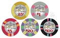
Top left for sure, I love the waves on the riviera part and the "Deja Vu" really stand out nicely.
Good point.. I think that yellow will really match the yellow fractional quarter pie. not sure about the grey/pink $1 and the red/white/arc yellow $5? Hmmm.If the top left was chosen, would all of the chips have the yellow font? I'm wondering if people like it because it happens to match an edge spot.
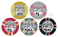
For me, I like top right with the denom from top left.
I would love to see all of the chips with the "Deja Vu" color matching the base color of each chip.
") of course I take what you all say very closely.
of course I take what you all say very closely.Thanks! Means a lot to hear that. Looking forward to get these on the new darker table felt and blue rope lighting.Top for me as well Spike... Beautiful, beautiful set man!!! You and J5 did a GREAT job...
Top set by a long shot.