paraDoxl
High Hand
Sounds like the start of a great jokeA poker room owned by two physicians?
")
But I'm no stranger to tinkering around with rotations - just in a different sense as I'm a software engineer
Sounds like the start of a great jokeA poker room owned by two physicians?
 ) would be to risky regarding dirty stacks? I have the feeling it might just be enough, but I figured I'd rather tap a bit more into the vast knowledge of this community
 ") Just noticed the background tiling might be a bit too opaque on this chip
Just noticed the background tiling might be a bit too opaque on this chip 
These are the Dark Labels/inlay that are the best !!!It has been quite a while since I last had time to work on this set, but I think I've (finally) settled on a color palette for the whole set I'm happy with. Can't really find time and motivation to finish the labels atm, but I'll get around to it at some point ^^
View attachment 1404496
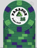
Currently, my sole concern remains the shade of green for the 500 edge spots. I've also tried dg green and light green instead of green:
You may have a point here, but I really don't like Lavender. I tried using DG peacock (and pretty much everything else) as an alternative body color, but I always ended up liking blue better for various reasons...25 and 500 look too similar to me
Lots before me used retro red and maroon.Ha, this color combo was way to nice to not already be out there, I guess...
You may have a point here, but I really don't like Lavender. I tried using DG peacock (and pretty much everything else) as an alternative body color, but I always ended up liking blue better for various reasons...
I guess the most realistic option for me is to change to 3V12 spots on the 500 to reduce the amount of green.
As a body color, I'd pretty much only consider light blue, but then I'd go much rather with DG peacock as body color. I tried Lavender as spot color next to Blurple on the 25, that didn't look too shabby. Also tried a bunch of others, but discarded them for various reasons (color repetition, bad compatibility with other colors). Chocolate kind of remained. Comparing them side by side, I still think the DG Green version is the best, but when considering the 500, all other three are probably better. Any thoughts or other ideas for the spot colors that could help with avoiding potential dirty stacks?If you change the 100 to charcoal you could use purple. You don't like retro lavender either? Or pink? Light blue would provide better contrast too.
Mock up purple/lavender base colors with whatever spots you like and show us what ~those~ look like.
Still not a fan of Lavender as body color and I fear using blurple would also kind of entail switching the 100 to charcoal (what I also would like to avoid, just think the black 100 looks way better)The 2000 is the one chip that doesn’t sing to me. But iI think the 5 is the issue. By OP starting so strong with the 5, the 2000 ends up with a very complicated (here) or a very simple (above). A simpler pattern with the 5 (say an 214) allows those spot patterns to slide right one. (I might have the wrong base color on the 2000.)Take this all with a grain of salt, but sometimes I think a completely different approach to a design can help think through what you want or don't want (might even solidify your own choices!). I spent about an hour quickly remaking the inlays and just threw together a 5 min edgespot progression w/ shaped inlays (building off yours some).
Throw it all out if you want, but just conceptually where my brain goes with the overall theme if I was going to start it.
View attachment 1457835
This is nice but I really like the canary edge spot on the black chip and the gold/canary triangle in the inlay. That is my favorite of the whole set. And I still like the black inlays.Take this all with a grain of salt, but sometimes I think a completely different approach to a design can help think through what you want or don't want (might even solidify your own choices!). I spent about an hour quickly remaking the inlays and just threw together a 5 min edgespot progression w/ shaped inlays (building off yours some).
Throw it all out if you want, but just conceptually where my brain goes with the overall theme if I was going to start it.
View attachment 1457835
I had it easy, I just built on the wonderful work from @CrattyGreen/blue 25 and blue/green 500 just don't work for me. Crattys and warmas look way better IMO, but I prefer warmas 2k
I can imagine worse than having a bunch of people iterating on my idea.I am pretty sure ParaDoxl is in a fetal position under his computer by now.
I really appreciate the time you all spent on this @Cratty, @warma, @GreatWhiteDope and @VerdeChipper (and of course everybody else who had feedback for me). A lot of things to be considered here. Some thoughts here: