paraDoxl
High Hand
Btw: A variant where I think Lavender might be ok, but I'm not sure if the contrast between the blue and the lavender is enough
 is
is
^This. Design 101: Don't use similar colors on two different chips.Green/blue 25 and blue/green 500 just don't work
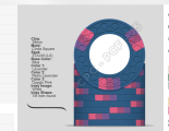
Good point, but where to draw the border? Is it ok to have the blue edge spots on the yellow and also have a blue chip (even only one denomination lower)? Is it ok to use blurple as edge spot on the 25 and then use Lavender as Edge spot on the blue? I guess opinions might differ when it comes to details, but @SteveEH certainly had a point that there was too much green on that iteration of the 500Design 101: Don't use similar colors on two different chips.
This is much better to differentiate between the 25 and 500. The 5 kinda looked like a 3 to me, maybe because of the shadow? Make sure to do an arms length test of a printed actual inlay sizeBtw: A variant where I think Lavender might be ok, but I'm not sure if the contrast between the blue and the lavender is enough
View attachment 1458181is
This is much better to differentiate between the 25 and 500. The 5 kinda looked like a 3 to me, maybe because of the shadow? Make sure to do an arms length test of a printed actual inlay size
There are definitely a lot of different color combinations that work with the blue.Thanks a lot, I like that nod to the Austrian Flag very much. Interesting that I never thought of this variant, because I have tried 3TA316 with my hometown flag (green-white-blue) with dayglo colors and bright white, which didn't really work because of dg peacock on blue and the repeated green, as other members pointed out. But it hasn't occurred to me yet that I could also use the Austrian flag (or maybe also the flag of my home federal state) could work here.
Also toyed around a bit with 3TA316 and I've tried a combination i found quite interesting. Very sunrise-like. Might be a bit too much, but I guess I'll know once I've slept on it:View attachment 1459060
Also seems to work for pink to lavender
For a 5 min mockup this is beautiful. The amount of quality sets you’ve made in the time you’ve joined is crazyTake this all with a grain of salt, but sometimes I think a completely different approach to a design can help think through what you want or don't want (might even solidify your own choices!). I spent about an hour quickly remaking the inlays and just threw together a 5 min edgespot progression w/ shaped inlays (building off yours some).
Throw it all out if you want, but just conceptually where my brain goes with the overall theme if I was going to start it.
View attachment 1457835
Shifted the orange spectrum to be one nuance darker, like the result better. Seems to also fit better with the other chips. (Mind I did this on mobile, still with the old inlays, but I suppose I will stick with the newer ones)
View attachment 1459263
View attachment 1459262
You're right, the 1/4 Pie pattern fits very nicely with the 4 Points inlay shape. But I fear I'm not too fond of 1/4 Pie and its variations, I'd rather just stay with the 4V12 version I currently have.I am completely enamored with the 2000 chip from Cratty's last mockup and think it would round out this set perfectly. You almost don't notice the shaped inlay but it looks like the edge spot has little points which I think is awesome. And you don't have the blue of the edge spot tying into the blue from the 500 chip.
And this is where the bottom line comes in. These are your chips and you are the only one whose preferences really matters. As I said earlier, I think you have arrived at a good place and I wish you many years enjoyment with them. Thanks for letting us come along for the ride.You're right, the 1/4 Pie pattern fits very nicely with the 4 Points inlay shape. But I fear I'm not too fond of 1/4 Pie and its variations, I'd rather just stay with the 4V12 version I currently have.
I can imagine a couple of variants, but as always, there are cons to each option:
1. Stay with what I have. Con: Blue Chip having similar color to edge spot on yellow chip
View attachment 1460142
2. Adjusting edge spot on yellow chip to use Blurple/Lavender instead of Retro Blue/DG Peacock. Con: Blurple is also used at spot color for green chip. (Have tried some options to use for green instead, didn't like any better than blurple. Could use retro blue or maybe blue though)
View attachment 1460146
3. Using a brighter base color for the blue chip as suggested by @SixSpeedFury Con: Personal preference. Thought of using light blue or grey. Both seem a bit boring to me. Also, grey is used as spot color in the 100 chip. I'd probably prefer to use DG Peacock as body color here, but that is also being used in the 2000 chip...
View attachment 1460149
4. Use purple as base color for the 500. Cons: Again, blurple used in the green 25 and personal preference - I just like the color of my blue samples better than that of the purple samples
View attachment 1460151
Currently, I'd take the con of option 1 and stay with what I currently have - the other variants all seem to break something else in this brittle construct of a set.
")
True, however I found the inlays to be pretty consistent (~80%) with my recent CPC set, and it followed the mockup photos. If you have some OCD-ish issues then doing this isn’t a good idea.There is no guarantee that if you use a 1/4 pie and the 4-notched shaped inlay that the pie transition will align perfectly with the notches.
)