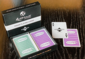
Help Me Create A Premium Deck of Poker Cards! (18 Viewers)

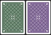
Is it pretty tradtional to have the suit within the court cards be right next to the corner suits? Seems somewhat redundant, though might also be good reinforcement:

View attachment 1489765

What if the boxes are flipped, so that the appearance of the suits on the court cards are more spread out across the card?

View attachment 1489766

Or combine the double suits into one:

View attachment 1489768

(Obviously this last one needs more tweaking of the rest of the layout than this simple cut-and-paste mockup, but it could result in an increase of the size of the box and court art, which might be cool/different.)

I love what you've done here, I especially like the reversed Courts, and occasionally the great manufacturers of yesteryear would do such a thing... I'm not sure my OCD would let me get away with it though! I've drawn so many card faces they just look the wrong way round to me :cry: They do look very nice though and I see what you mean about the balance with the pips, it does work aesthetically
 
Right. I believe artwork is just about done. I have made an executive decision on the following attributes, knowing that it won't possibly please all - I apologise in advance and sincerely hope I am in a position to produce a PVC Poker deck to your liking in the not too distant future!

- Poker size
- Green & Purple backs

The Poker vs. Bridge thing was basically a coin toss, and I ultimately went with what I intended to create when I first set out - but it did become a tough decision to make, Bridge guys weren't just disregarded I promise!

Back colour choice was made for two reasons: firstly, I wanted something a little different from the regular red & blue. And second, going through old threads on here, it became apparent that there might be an issue with printing consistent red tones onto PVC, even by well respected print houses. So I went with purple/green.

Therefore, finished artwork, pending any last minute revisions, is as follows:
 
final faces prev 1.jpg

final faces prev 2.jpg

final backs prev.jpg

final faces prev.jpg
 

Attachments

  • final backs prev.jpg
    final backs prev.jpg
    393.2 KB · Views: 38
Last edited:
Look very nice. The green/purple back colours may be too close to be useful to those like me with red/green issues...I had similar decks from Desjgn in the past that were problematic in some lighting conditions. But I am in the minority.
+1 on the color issues, color deficient eyes. if either color can be made brighter it'll help alot
 

Attachments

  • Screenshot 2025-04-07 at 5.52.23 PM.png
    Screenshot 2025-04-07 at 5.52.23 PM.png
    858.3 KB · Views: 33
Just heard back from another of my top choices: fournier! They have much lower MOQs and are in the process of drawing up a quote. I am hoping that they will become a realistic alternative to consider without compromising on quality. Also gonna finalise a few things and start a group buy thread ASAP for those who are interested! Cheers :)
 
Regards the purple/green backs, I will keep them more-or-less as they are shown in my examples above, but just tweak slightly with some print tests to make sure they are noticeably different, if that means just adjusting one of the colours ever so slightly (probably the purple as I love dark green) without any significant changes to colour
 
Like it!

I would just removed "100 Plastic" and "Superior quality" from AoS....

Every time I see something like "casino quality" on cards I steer away from them...also you will get cleaner look,
 
I'd vote for brighter green. Purely own opinion, I think green looks better as a bright color vs bright purple.

IMO a green/purple combi like this looks good

That would work.

Regards the purple/green backs, I will keep them more-or-less as they are shown in my examples above, but just tweak slightly with some print tests to make sure they are noticeably different, if that means just adjusting one of the colours ever so slightly (probably the purple as I love dark green) without any significant changes to colour

A lighter purple would also work.
 
Like it!

I would just removed "100 Plastic" and "Superior quality" from AoS....

Every time I see something like "casino quality" on cards I steer away from them...also you will get cleaner look,
I agree. I’d rather have a simple elegant design and a ifyky mystique about them.

No label brands are the best
 
Regards the purple/green backs, I will keep them more-or-less as they are shown in my examples above, but just tweak slightly with some print tests to make sure they are noticeably different, if that means just adjusting one of the colours ever so slightly (probably the purple as I love dark green) without any significant changes to colour
The big thing is what they look like printed in real lighting. I have no issues with them on a screen, but have had issues with shades like these in the past in physical form. And unfortunately dark green is normally the culprit.
 
I will check through that simulator. I'd genuinely like my product to be user-friendly for everyone as much as possible.
 
Like it!

I would just removed "100 Plastic" and "Superior quality" from AoS....

Every time I see something like "casino quality" on cards I steer away from them...also you will get cleaner look,
100% this

Fournier is great news! Unfortunately poker size as well as green/purple backs are both big turn offs for me.

Poker/bridge preference is probably a toss up but I do think not going with classic back colors might be a mistake.
 
They're looking really good! I'd also leave off "superior quality" but it's a nit. The colors look good to me and I'm colorblind. If you go with Fournier go with bridge size. Fournier bridge size cards handle better than poker size because they tend to be a tad on the stiff side.
 

Create an account or login to comment

You must be a member in order to leave a comment

Create account

Create an account and join our community. It's easy!

Log in

Already have an account? Log in here.

Back
Top Bottom