You are using an out of date browser. It may not display this or other websites correctly.
You should upgrade or use an alternative browser.
You should upgrade or use an alternative browser.
Sale Made-to-order Custom Table Toppers (72 Viewers)
- Thread starter rjdev7
- Start date
JFG
Pair
Themes I’m working on:
Overlook Hotel & Gold Room
Ocean’s 11
Rocky
Bellagio
The God Father
Rounders
Overlook Hotel & Gold Room
Ocean’s 11
Rocky
Bellagio
The God Father
Rounders
wickedwonka121
Flush
Yup!!!I see you guys were serious about Kubrick
If I continue on this, is anyone going to be interested in one? It's a butt load of color grading work lol
View attachment 1050378
Have you seen my Rounders toppers?Themes I’m working on:
Overlook Hotel & Gold Room
Ocean’s 11
Rocky
Bellagio
The God Father
Rounders
Mike mac
4 of a Kind
@Mike mac
Getting close. I need to add key 237 and adjust the colors. Any ideas for improvements?
View attachment 1050308
Could you put the maze in the inner area ? And then the over lookover overlaid on top ?
PsssssstttttttCould you put the maze in the inner area ? And then the over lookover overlaid on top ?
Mike mac
4 of a Kind
I mean, from a design point.. to have a maze and a name, and the key, and the carpet ....and the Hotel added as well, is getting cluttered
Totally. Less is sometimes more, especially given the complex nature of the carpet and maze patterns.I mean, from a design point.. to have a maze and a name, and the key, and the carpet ....and the Hotel added as well, is getting cluttered
JFG
Pair
I had originally made the following logo, but it didn’t look right with the carpet. Too many competing patterns. I’m doing another one with the hotel and maze as the background with a retro font. The gold room will basically be like the Bellagio but with the gold room logo.Could you put the maze in the inner area ? And then the over lookover overlaid on top ?
JFG
Pair
Yes. I want to do something more in the genre of the movie.Have you seen my Rounders toppers?

JFG
Pair
I thought about doing this. This is one of the best transitions in the movie.
Ok bellhops, Come play with us! Or are least be Seduced into some gambling debauchery by Lorraine I'm Room 237. Just remember, Jack, she's not as pretty on the inside as she seems at first glance.

Edit:Close up on the carpet

Edit:Close up on the carpet
Last edited:
Mike mac
4 of a Kind
Ok bellhops, Come play with us! Or are least be Seduced into some gambling debauchery by Lorraine I'm Room 237. Just remember, Jack, she's not as pretty on the inside as she seems at first glance.
View attachment 1050438
Edit:Close up on the carpet
View attachment 1050448
I love the boarder and the maze background. The words and font just don’t work for me. But the boarder and the maze fade are both grand slam.
All ears. I mean the room is specific to Lorraine, it still needs to have some time in to poker, otherwise, why have a betting line? And the font is in about the only two colors that can work with purple and bright green, the don't itself is an Art Deco style, because though the story takes place in the 70's, the real golden age of the hotel, was in 1921, at least according to the picture of the July 4th party from the gold room.. I mean, everything textwise can be removed and it just have a stylized "Overlook Hotel" in the center, but the top is really only indicative of one specific room at the hotelI love the boarder and the maze background. The words and font just don’t work for me. But the boarder and the maze fade is a grand slam.
Mike mac
4 of a Kind
https://www.pokerchipforum.com/attachments/7d088d5b-9109-4ca9-8123-1fe160748b2e-jpeg.1050433/
Could we overlay this on top of the maze and have it translucent ?
Could we overlay this on top of the maze and have it translucent ?
I can't just use @JFG artwork eitherhttps://www.pokerchipforum.com/attachments/7d088d5b-9109-4ca9-8123-1fe160748b2e-jpeg.1050433/
Could we overlay this on top of the maze and have it translucent ?
Mike mac
4 of a Kind
Transparent ? Not sure if my words are working here. English is not my first language.
wickedwonka121
Flush
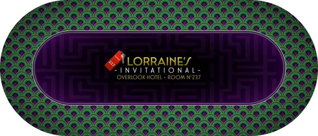
Want!!Alright, I did a bit of color work and a little text and line work on this. I'm calling it done, and I'll make it available for anyone to order it through @rjdev7
The Overlook Hotel R237:
View attachment 1050665
And a good ol close up:
View attachment 1050666
Happy New Year everyone!
Mike mac
4 of a Kind
It looks fooking amazing !
wickedwonka121
Flush
Damn str8!!!!It looks fooking amazing !
BruceWayne
Flush
Alright, I did a bit of color work and a little text and line work on this. I'm calling it done, and I'll make it available for anyone to order it through @rjdev7
The Overlook Hotel R237:
View attachment 1050665
And a good ol close up:
View attachment 1050666
Happy New Year everyone!
@Thisfiendis138
Thisfiendis138
Full House
Anyone looking for a set to go with this sweet topper?Alright, I did a bit of color work and a little text and line work on this. I'm calling it done, and I'll make it available for anyone to order it through @rjdev7
The Overlook Hotel R237:
View attachment 1050665
And a good ol close up:
View attachment 1050666
Happy New Year everyone!
Sounds like you have a sweet set to get this topper for....Anyone looking for a set to go with this sweet topper? View attachment 1050871
Thisfiendis138
Full House
Sounds like you have a sweet set to get this topper for....
Mike mac
4 of a Kind
Show me this alleged set
Thisfiendis138
Full House
Mike mac
4 of a Kind
@Mike mac
Getting close. I need to add key 237 and adjust the colors. Any ideas for improvements?
View attachment 1050308
Some how put these in the inner oval ? Not sure if it can be layered - maze in back and overlook image and letters over lap ?
Attachments
Similar threads
- Replies
- 1
- Views
- 397
Reshipping (ordering closed)
Table Toppers - Group Buy
- Replies
- 422
- Views
- 22K
- Replies
- 16
- Views
- 594

