Get them finished so we can use them!!!!6 months later...
Chips in hand, the turquoise felt muted against the otherwise electric color of the Royals. I tried a few "fixes", but they only cluttered the design. Slipping into a funk, I set the project aside until I could be inspired again.
And I was...
View attachment 381952
A sharper edge glass to reflect the electricity of the chip. "Martini Lounge" in a softer blue color, representative of the chill effect of a perfect martini. I stuck with a simple "pimento" red for the denom, rather than a color-match to keep the chips more uniform than my typical "all over the place" motif of the zombie series.
What say you all?
You are using an out of date browser. It may not display this or other websites correctly.
You should upgrade or use an alternative browser.
You should upgrade or use an alternative browser.
Martini Lounge (1 Viewer)
- Thread starter Poker Zombie
- Start date
Clean and simple. I dig it a lot.
For the record I really like the vibe of the first revisions too though! Can't go wrong either way. Nicely done.
For the record I really like the vibe of the first revisions too though! Can't go wrong either way. Nicely done.
Poker Zombie
Royal Flush
I had considered back-shelving the project, and saving the revisions for another day, and using the Royals for a Casino Royale set. The CR logo from the table in the 2006 movie, and the denom on the back in a gunbarrel view, like the popular opening scene, with the lowest denom on the far right, and each successive denom getting closer to the middle until the top denom had the blood drip.
It would have worked well for the Royals "crown" mold, but Martini Lounge is more personal. ML isn't just Martini Lounge, it's My and Liz's initials.
It would have worked well for the Royals "crown" mold, but Martini Lounge is more personal. ML isn't just Martini Lounge, it's My and Liz's initials.
I think the font colour for "Martini Lounge" went a little too dark, especially against a black background. Perhaps try a more turquoise shade? Thinking of old school neon here....
FordPickup92
Royal Flush
Really like the new mock up! Very casual yet also high class at the same time! The royals are great templates, nice work! I think an accent color ring around the label edge would put a little pop into them.
Poker Zombie
Royal Flush
I had a color ring, but it crowded the chip. Also, (pro designer tip) black ink tends to "spread", so everything touching black will print about a pixel or two thinner all around. That would mean a fairly thick ring, shrinking everything else.Really like the new mock up! Very casual yet also high class at the same time! The royals are great templates, nice work! I think an accent color ring around the label edge would put a little pop into them.
FordPickup92
Royal Flush
Touche! Good points!I had a color ring, but it crowded the chip. Also, (pro designer tip) black ink tends to "spread", so everything touching black will print about a pixel or two thinner all around. That would mean a fairly thick ring, shrinking everything else.
Poker Zombie
Royal Flush
T5000 lightened up the BlueI think the font colour for "Martini Lounge" went a little too dark, especially against a black background. Perhaps try a more turquoise shade? Thinking of old school neon here....
T1000 Turquoise
T25,000 a possible reverse side option. Because @Mrs Poker Zombie and I often use "M+L" for various causes, I thought about a chip highlighting the M+L connection, by minimizing everything else and letting the M+L stand out. However, if the M+L does not stand out to her, I'll stick with the same design front and back.
Last edited:
I got an idea. Use the text colour you have for the 5000, and outline it with the Turquoise colour you have on the 1000. It might give you the nice neon glow effect. You can try the same trick with the capital M and L on your 25000 chips to see if it makes it stand out in a nice way.
Timmy501
Pair
I like the drop down shadow! Looks awesome.I would be interested (I do like your VooDoo Lounge font). The latest revision has me here...
View attachment 281217
View attachment 281218
Debating between the outline, the drop shadow, and the denom color.
SixSpeedFury
Full House
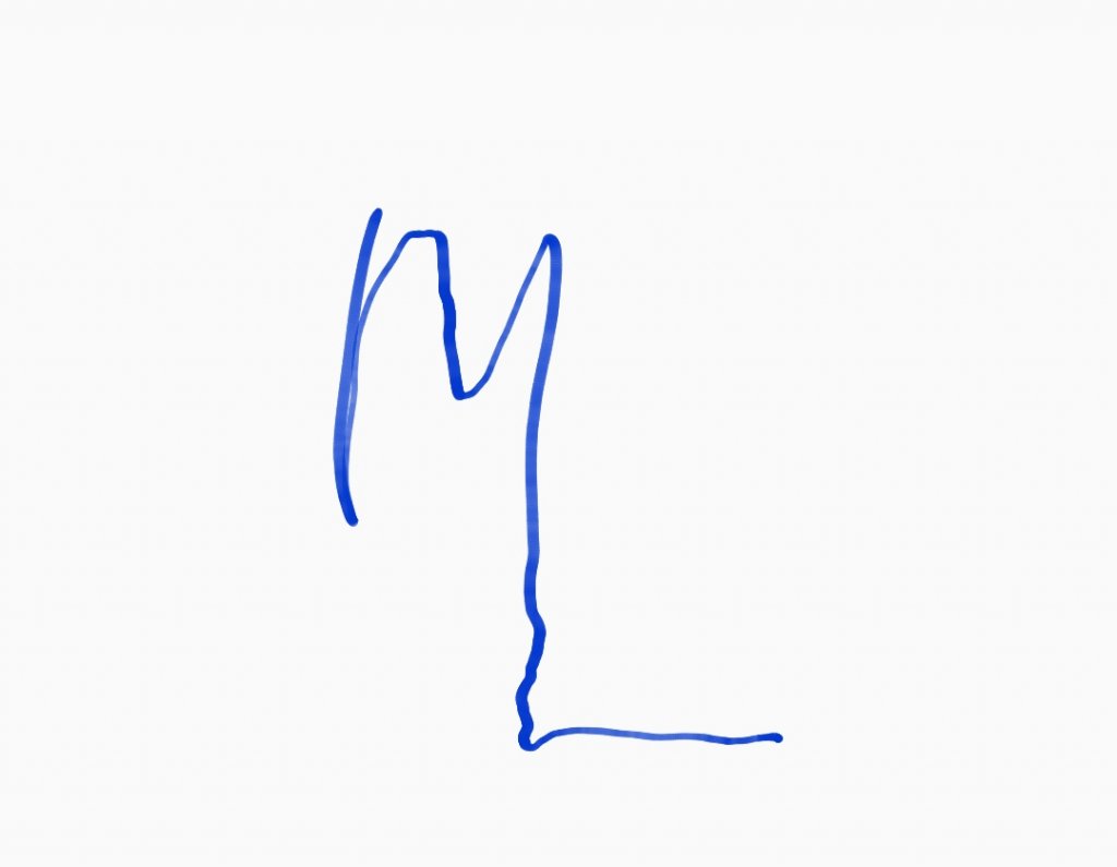
Probably do something like this? Just a thought
detroitdad
Royal Flush
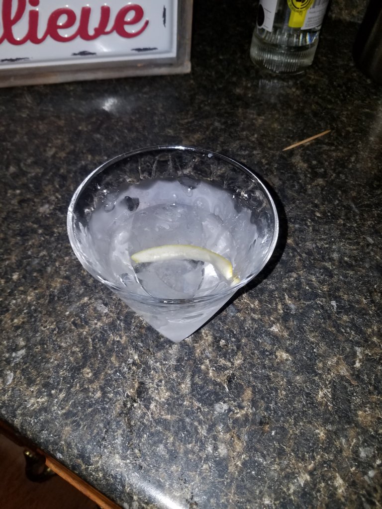
Figure this goes in the martini lounge.
I’m a huge fan of colored inlays I’m not a fan of white inlays at all.
DeeVee8
Flush
I dig.
detroitdad
Royal Flush
T5000 lightened up the Blue
T1000 Turquoise
T25,000 a possible reverse side option. Because @Mrs Poker Zombie and I often use "M+L" for various causes, I thought about a chip highlighting the M+L connection, by minimizing everything else and letting the M+L stand out. However, if the M+L does not stand out to her, I'll stick with the same design front and back.
View attachment 382049
i like it!
Forest@Farmington
Straight
Looking good. Love the inlay
Poker Zombie
Royal Flush
That's actually my next iteration. Will probably be ready on Tuesday, because weekends and work demand so much time.Probably do something like this? Just a thought
View attachment 382596
Poker Zombie
Royal Flush
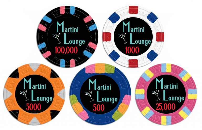
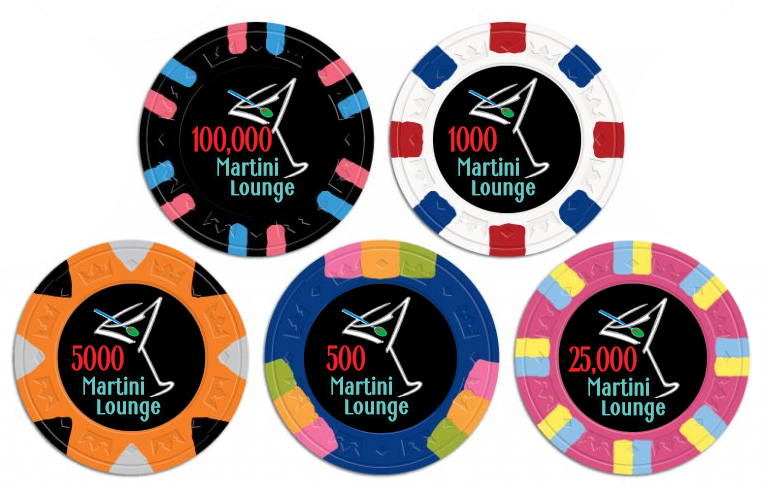
Two sided. Very few adjustments to be made still, but they will be minor. I'm pretty happy with where we landed.
detroitdad
Royal Flush
Two sided. Very few adjustments to be made still, but they will be minor. I'm pretty happy with where we landed.View attachment 383973
View attachment 383974
Any extras? I'd love either a sample set, or single chip that i could use as a card v protector.
If not, no worries.
Poker Zombie
Royal Flush
I thought about buying extras, but thought, "Nobody wants sample sets of China Clays."
I may have been mistaken.
I may have been mistaken.
Lighter font colour looks fantastic!
Poker Zombie
Royal Flush
Thanks! I was skeptical, but do enjoy trying out the ideas of others. Once I saw it, I had to go with the better color. I also tried to lighten the denom, but that was a pinkish fail, and reverted to pimento red.Lighter font colour looks fantastic!
Nice. Have you considered joining the M and L letters in the design (especially the top version)? Extending the right downstroke of the M become the vertical downstroke of the L?Two sided. Very few adjustments to be made still, but they will be minor. I'm pretty happy with where we landed.View attachment 383973
View attachment 383974
Poker Zombie
Royal Flush
We did do that, but it looked "corporate". Very "fall in-line". Not like the blues bar concept we envisioned. It also detracted from the "M&L" which we were leaning towards.Nice. Have you considered joining the M and L letters in the design (especially the top version)? Extending the right downstroke of the M become the vertical downstroke of the L?
detroitdad
Royal Flush
I thought about buying extras, but thought, "Nobody wants sample sets of China Clays."
I may have been mistaken.
It's not the chip. It's the design.
ekricket
Royal Flush
Probably do something like this? Just a thought
View attachment 382596
Are you apprenticed to @BonScot?
FordPickup92
Royal Flush
Just seeing the changes made, I really really like the new font color!
SixSpeedFury
Full House
I thought about buying extras, but thought, "Nobody wants sample sets of China Clays."
I may have been mistaken.
Highly mistaken
Poker Zombie
Royal Flush
Ta-daaaaaa....
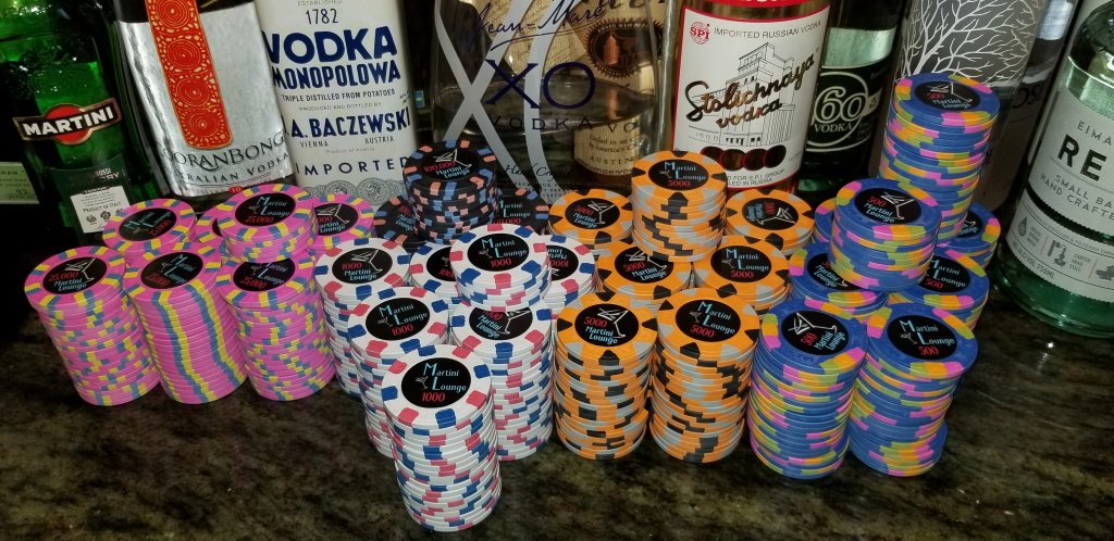
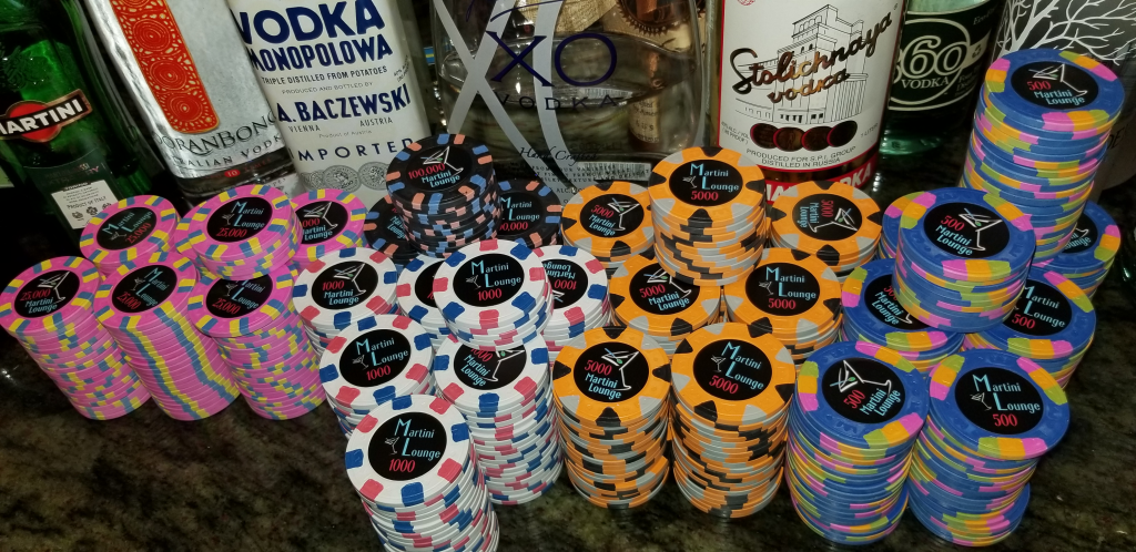
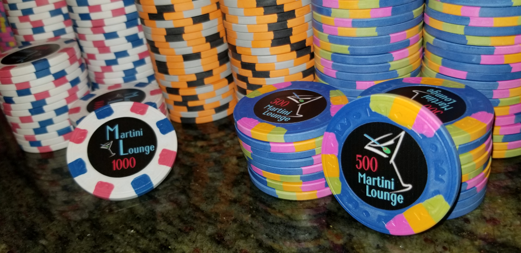
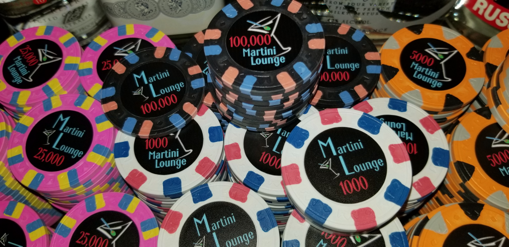
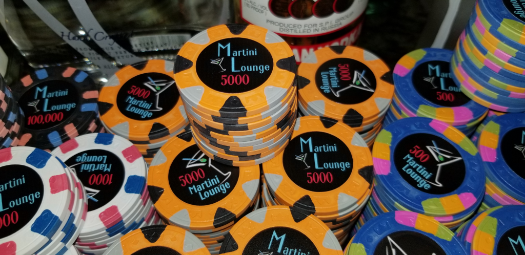
The process took 309 days from first concept to final label applied. I appreciate everyone that stuck around for the whole journey. Looking back at post #1, there have been some radical changes. I an so glad I didn't just didn't go with the first idea that popped into my head.
I'd like to thank everyone that gave input on the project. I must admit that I was a bigger fan of the turquoise background originally, but there were enough supporters of the dark background that I had to keep pursuing it. But there are a few people to whom I have to give shout-outs...
- @crussader was the first to point out that the turquoise might clash, and from there I had to go to the dark background - thanks for the push.
- @k9dr , who posted a pic of a martini glass bar sign. That got me to thinking how I could re-do the dark background chip, and that led me to my final artwork. Funny how an off-handed comment means all the difference in the world.
- @allforcharity , who suggested that my "Martini Lounge" coloring was too dark. I admit that I was resistant to the idea, but absolutely every suggestion gets mocked up, and this one was a winner. It took me from really liking the chip to loving it.
- @detroitdad amd @SixSpeedFury , for suggesting that they would be interested in sample sets. I've never even seen a China clay sample set given out before, so to know that at least two people would have been interested makes me think that this was a design that is loved by more than me and the Mrs.
- Finally, @Mrs Poker Zombie , for putting up with my 15th set, not counting dice chips, partial sets, novelty chips, or cheap interlocking chips. Fifteen sets. We play eight times a year, not counting heads-up events between the two of us. Fifteen. I may have a problem.
DeeVee8
Flush
Very classy!
Similar threads
- Replies
- 30
- Views
- 1K
- Replies
- 84
- Views
- 9K
- Replies
- 97
- Views
- 10K
- Replies
- 58
- Views
- 6K
