new to this design thing; would you mind giving an example of a 'hub shaped' please?The stars on the outer ring have potential. My instinct is to add a bit more to it. A gradient or an inner star in the background color, something to make it stand out a little more.
Other than that, I do like the concept, only nitpick is that it seems a little too triple-y, and am not sure where the denom will go.
Very simple and understated. How about a hub shaped inlay for this denom?
Post mockups for fun/science? (49 Viewers)
- Thread starter lherron
- Start date
improviseallday
Flush
Like this:new to this design thing; would you mind giving an example of a 'hub shaped' please?
Attachments
thank you!
Go for it! Don’t feel trapped by traditional machine-made spot patterns. Make something cool!Probably went to far with this but it was fun making the patterns
View attachment 1198333
binoclard
Pair
Love the bold retro minimalism!
I would just slightly move down the wagon to balance a bit the white spaces.
My only gripe: I am not super fan of the font you picked, it has a "Papyrus" / "fantasy font" vibe. I think you could find something a bit more "robust", with more inspired credibility and a vintage railroad type feel.
If you want to go with the handmade, handwriting lettering style, I think you can find more interesting choices.
If you want to keep this one for you own reasons, I would work a tiny bit the kerning (the T I, A Y, M E pairs).
It could be nice to have slightly different wagons across the chips, and a locomotive for the highest denom.
binoclard
Pair
Probably went to far with this but it was fun making the patterns
View attachment 1198333
Yay! Ceramics are perfect to venture outside the box, between your two versions, it is definitely more interesting.
I would propose to capitalise on your pattern idea, and make the "inlay" a bit smaller (perhaps shrink to the inner diameter of your black ring?).
I would like to try to make the font a bit smaller, to distribute it a bit better, and put the denom down in the space between the r and the T. Or not. Just a thought.
For me you do not need the three dots, there are superfluous, bring not much meaningful, and imho grab to much attention in detriment of the rest.
It is the first thing the eyes move to, and it the only thing of the whole layout that conveys absolutely nothing (yes "triple", but I think we get it
Cool project.
improviseallday
Flush
The pattern is a bit bright on my screen, but it could work printed on a chip. I wonder if it'll be more balanced if you picked a different color for the ring graphics instead of bright white.Probably went to far with this but it was fun making the patterns
View attachment 1198333
kirchhausen
Flush
Just effing around on the chip design tool, dreaming about a cali set I will likely never get made

improviseallday
Flush
Chippy McChiperson
Straight Flush
improviseallday
Flush
Completed the set.

louBdub
4 of a Kind
binoclard
Pair
I saw it first on my phone, lol'd, but did not see that the legends were all different.
RandomBrandon
Sitting Out
improviseallday
Flush
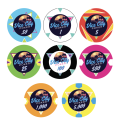
Absolutely love the inlay and the 5 spot.would love some thoughts on this 80/90s themed ceramic set I designed...any constructive feedback would be appreciated!
The 100 is a tricky one. Have you tried a color matched ring around the inlays or a charcoal instead of black? That'll let your inlay stay dark.
Lord_Foldemort
High Hand
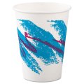
The design is sick! I think they have a super retro feel. The $1 chip reminds me of the old solo cups! I do think finding a way to have the $100 inlay match everything else would round things out.would love some thoughts on this 80/90s themed ceramic set I designed...any constructive feedback would be appreciated!
Attachments
RandomBrandon
Sitting Out
I can definitely give that a try. Appreciate the suggestion.Absolutely love the inlay and the 5 spot.
The 100 is a tricky one. Have you tried a color matched ring around the inlays or a charcoal instead of black? That'll let your inlay stay dark.
RandomBrandon
Sitting Out
That cup design brings back so many memories! Thanks for the feedback!The design is sick! I think they have a super retro feel. The $1 chip reminds me of the old solo cups! I do think finding a way to have the $100 inlay match everything else would round things out.
Chippy McChiperson
Straight Flush
Ok, I need help with a 25 and a 5k. Also, which 1k do you like better?

Butterscotch for me
Chippy McChiperson
Straight Flush
Thoughts?

improviseallday
Flush
Like the 100/500/1k/5k sequence.
IMO the 25 could be simpler to provide spot progression.
Latest iteration of the future cash set.
The inlays shown below are hyper crude and will be worked up by one of our PCF resident experts at some point. The intent is they look like aged paper, slightly browning at the edges:

The inlays shown below are hyper crude and will be worked up by one of our PCF resident experts at some point. The intent is they look like aged paper, slightly browning at the edges:
Mercurochrome
Waiting List
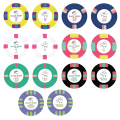
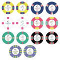
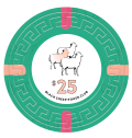
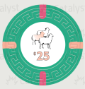
Hi y’all! New here, but hoping to get some feedback on a custom set I’ve been working on. Specifically would like some tiebreaker votes on having the small “Black Sheep Poker Club” on the back as well vs keeping it super simple without. The fiancé and I haven’t been able to agree on which we like better
Attachments
Without, by far. I worry poker club and the location on the front are too small. On the back, it’s awkward and looks cheap. Be bold and proud of the logo.Hi y’all! New here, but hoping to get some feedback on a custom set I’ve been working on. Specifically would like some tiebreaker votes on having the small “Black Sheep Poker Club” on the back as well vs keeping it super simple without. The fiancé and I haven’t been able to agree on which we like better
I think if you (or anyone) is thinking about adding small font, just get rid of it. Either that or somehow incorporate it differently into the art.
As to why the black sheep isn’t black on the back, well, that has my head aching. Maybe keep it black and add color another way? A tuft of grass, perhaps?
Last edited:
MichaelBubly
Flush
I would probably vote keeping simple and going the same on both sides, but I don't mind the switch up. Would drop the text if you go different labels on each side.Hi y’all! New here, but hoping to get some feedback on a custom set I’ve been working on. Specifically would like some tiebreaker votes on having the small “Black Sheep Poker Club” on the back as well vs keeping it super simple without. The fiancé and I haven’t been able to agree on which we like better
Not sure how Tina Hybrids work, but I would guess having additional label designs and different labels on each side would likely have some additional costs involved regarding setup fees etc, but I could be well off base on this. But probably worth a mention for consideration.
Mercurochrome
Waiting List
Thanks for the input @warma, That was my thought as well to keep it simple with just the logo and denomination on the back. Will also try it out with all black sheep on the backs to see how it looks. I like the tuft of grass idea to add a little color to keep it fun.Without, by far. I worry poker club and the location on the front are too small. On the back, it’s awkward and looks cheap. Be bold and proud of the logo.
I think if you (or anyone) is thinking about adding small font, just get rid of it. Either that or somehow incorporate it differently into the art.
As to why the black sheep isn’t black on the back, well, that has my head aching. Maybe keep it black and add color another way? A tuft of grass, perhaps?
The fiancé and I were also concerned about whether some of the font on the front may be a little too small. Will make “poker room” and location a little bigger in the next mock-up as well!
binoclard
Pair
Trying some stuff while setting up an Illustrator base file to do mockups and play with spots patterns. If/when I do a ceramic set, I'll try to have the best of both worlds: the possibilities of full print, and the usability and aesthetic of traditional spots.
Some half-pie + small spots bastard pattern. I quite like it, the face has potential, and the barrel simulation is super nice imho.

Some half-pie + small spots bastard pattern. I quite like it, the face has potential, and the barrel simulation is super nice imho.
binoclard
Pair
Hi y’all! New here, but hoping to get some feedback on a custom set I’ve been working on. Specifically would like some tiebreaker votes on having the small “Black Sheep Poker Club” on the back as well vs keeping it super simple without. The fiancé and I haven’t been able to agree on which we like better
Nice!
AFAIK, you cannot have different label on the Greek mold, I think I have read this somewhere in the group buy thread.
That said, I think your inlay has potential, perhaps just a tiny bit of "tightening", playing with the sizes and the spaces.
I think the idea of a colour-matching sheep is quirky/fun and could work well! Perhaps put Black Sheep in black/dark grey, and colour the sheep? Worth trying imho.
I would suggest to work on the kerning / letter spacing. B L is too wide, L A too narrow, H E too wide, etc.
Cool name by the way.
Odd. Bummer.AFAIK, you cannot have different label on the Greek mold, I think I have read this somewhere in the group buy thread.
Similar threads
- Replies
- 12
- Views
- 468
- Replies
- 97
- Views
- 10K
- Replies
- 169
- Views
- 25K
- Replies
- 10
- Views
- 2K

