You are using an out of date browser. It may not display this or other websites correctly.
You should upgrade or use an alternative browser.
You should upgrade or use an alternative browser.
Post Your Mockup and I Will Brutally Eviscerate It (With Words) (10 Viewers)
- Thread starter MrCatPants
- Start date
MrCatPants
Full House
Tina: "ok? Yes, yes. We respect design. Ok bye." Hangs up. "MAKE ONE MILLION POKER LAKE CHIPS."
bergs
Royal Flush
In.“Hi, Tina, I’d like 5500 of the Mount Saint Helens Disaster chips, yes, yes, I know what the label says, but those are the ones”.
merkong
Full House
That's what matters! One nation's manufactured famine that decimated a population is another nation's joke once a year in March.I don’t even know WTF that means but I laughed as I posted it.
merkong
Full House
And I’m half Irish. LolThat's what matters! One nation's manufactured famine that decimated a population is another nation's joke once a year in March.
And I’m half Irish. Lol
Me, too. After every Guinness.
Franzister
Pair
THE HUMANITY.... TEH HIMANITY !! !!!“Hi Tina… Can I get a tribute cash set of The Great Irish Potato Famine? Thanks bye!”
chipinla
Straight Flush
- Joined
- Apr 12, 2018
- Messages
- 8,358
- Reaction score
- 23,554
BONES! Gonna see if I can dig out some old Thrashers.Give it to me
MrCatPants
Full House
Ok. So there's this thing called dirty stacks.Give it to me
Seriously - you used like 5 total "colors" - this would be a nightmare in play. Most chips are going to get lose in stacks with the others. Add some variety, brutha!
Also there's a fine line between a stylistic inlay and an inlay that looks like it was drawn with a stylus. Everything is too thin, too curvy.
1/2 pies blow.
Last edited:
Ok. So there's this thing called dirty stacks.
Seriously - you used like 5 total "colors" - this would be a nightmare in play. Most chips are going to get lose in stacks with the others. Add some variety, brutha!
Also there's a fine line between a stylistic inlay and an inlay that looks like it was drawn with a stylus. Everything is too thin, too curvy.
1/2 pies blow.
Franzister
Pair
Did you ever see Search For Animal Chin? We used to make jump ramps out of bricks and plywoodBONES! Gonna see if I can dig out some old Thrashers.
Franzister
Pair
I knew I could count on you... If 1/2 pies blow, do cream pies suck? lol...Ok. So there's this thing called dirty stacks.
Seriously - you used like 5 total "colors" - this would be a nightmare in play. Most chips are going to get lose in stacks with the others. Add some variety, brutha!
Also there's a fine line between a stylistic inlay and an inlay that looks like it was drawn with a stylus. Everything is too thin, too curvy.
1/2 pies blow.
Too much black, more color variety, and maybe don't use an image that was taken from 1970's surfer graffiti
Franzister
Pair
omg that video is 15 f'n minutes
chipinla
Straight Flush
- Joined
- Apr 12, 2018
- Messages
- 8,358
- Reaction score
- 23,554
Make that $1 a trimoon and you're cookingOnly because I know how much @MrCatPants loves movie themed chips.
View attachment 1134634
View attachment 1134635
chipinla
Straight Flush
- Joined
- Apr 12, 2018
- Messages
- 8,358
- Reaction score
- 23,554
Make that $1 a trimoon and you're cooking
MrCatPants
Full House
I have strong feelings about these. I like and dislike in equal amounts - there is no ambivalence.Only because I know how much @MrCatPants loves movie themed chips.
View attachment 1134634
View attachment 1134635
The .05 is a creamsicle. Simple, unobtrusive like a nickel chip should be.
The .25 is a nice progression. Let's do something different than white though.
The $100 is solid as well.
Now...Ho Lee Fuk.
Feedback point 1: The $1/$5/$20 are like smidges away from each other on the color spectrum. Not just dirty stacks, but dirty pots and racks as well. Keep the $5. That's nice. The rest? Go back to work. Did you use the same color on three chips in a row? HOW LONG HAVE YOU BEEN HERE?
Feedback point 2: the inlay. Stylistically, I get it when it's all zoomed in. But it's a messy disaster in real life - too many pale colors (including white text on a light background!) with too much detail and too much stylistic font. You can print this on a big metal sign. not on a 7/8inch inlay.
Lastly: "Malts; Sundaes; Cards; Cones"? Does Bank of America advertise Loans; Credit Cards; Strip Club; Treasury Management? One of these things does not belong.
chipinla
Straight Flush
- Joined
- Apr 12, 2018
- Messages
- 8,358
- Reaction score
- 23,554
I was really hoping you would have caught this.I have strong feelings about these. I like and dislike in equal amounts - there is no ambivalence.
The .05 is a creamsicle. Simple, unobtrusive like a nickel chip should be.
The .25 is a nice progression. Let's do something different than white though.
The $100 is solid as well.
Now...Ho Lee Fuk.
Feedback point 1: The $1/$5/$20 are like smidges away from each other on the color spectrum. Not just dirty stacks, but dirty pots and racks as well. Keep the $5. That's nice. The rest? Go back to work. Did you use the same color on three chips in a row? HOW LONG HAVE YOU BEEN HERE?
Feedback point 2: the inlay. Stylistically, I get it when it's all zoomed in. But it's a messy disaster in real life - too many pale colors (including white text on a light background!) with too much detail and too much stylistic font. You can print this on a big metal sign. not on a 7/8inch inlay.
Lastly: "Malts; Sundaes; Cards; Cones"? Does Bank of America advertise Loans; Credit Cards; Strip Club; Treasury Management? One of these things does not belong.
MrCatPants
Full House
I don't recognize oversize labeled RHCs as valid chips.I was really hoping you would have caught this.
View attachment 1134669
MeridianFC
Flush
I feel like the one thing my day needs is cat piss all over my deign. Tri Moon FTW!

MrCatPants
Full House
These made me feel more color blind than I am.I feel like the one thing my day needs is cat piss all over my deign. Tri Moon FTW!
View attachment 1135228
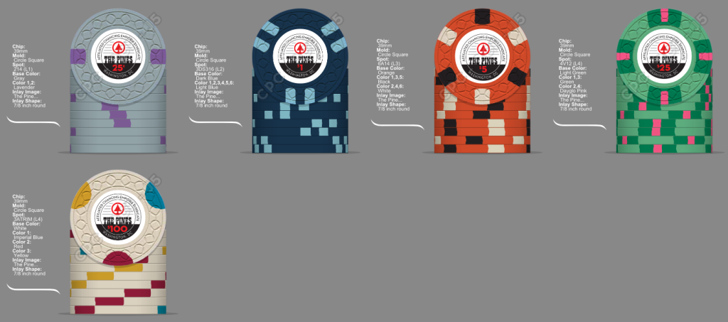
Very monochromatic. I imagine the game where these chips are being played - it's raining outside, the over under for men wearing weird hats like berets and derbys is 1.5, a 3-bet pre-flop causes quiet shunning of the aggressor, the snacks include hummus and impossible burger sliders with goat cheese, and someone won't stop droning on about the philosophy book they are reading.
The $5 is like candy corn without the fun of yellow. So like more terrible candy corn.
I zoomed on that inlay with the tiny font as much as I could and still couldn't make anything out. "Affected Chanklins Expose Binoculars"? Wtf is a chanklin? Inlays are tiny, people!
If you are going to do white, do bright white. If you're spending thousands on CPCs, spring the few extra cents per chip of your least common chip for clean clay.
All tri moons are trash.
BillyBrooks
Sitting Out
MrCatPants
Full House
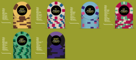
Yo guys I'm hammered let's be plagh ar der Billargio? None o dat hold them B.S. - reeeeel pocker.This is about the 100th iteration, show me my flaws
You, like many on here, do not seem to ascribe to the 'spot progression is sacred' crowd. Spot progression is sacred - these chips are all out of order with their spot complexity. Simple chips low denom, complex chips high denom.
Spring for bright white if you are going to do a white chip.
The colors on that $2 are fine, but the offset spots are not.
The $5 makes me sad; try again.
Yo dawg, I heard you like green, so I put green next your green on green that's next to a chip of the next closest denomination that also has green spots. Don't do that.
All quarter pies are trash.
The inlay is too small with too stylistic of font. You won't be able to make much out.
BillyBrooks
Sitting Out
All I got from this is you like the 50c chip and you don't like watermelons.Yo guys I'm hammered let's be plagh ar der Billargio? None o dat hold them B.S. - reeeeel pocker.
You, like many on here, do not seem to ascribe to the 'spot progression is sacred' crowd. Spot progression is sacred - these chips are all out of order with their spot complexity. Simple chips low denom, complex chips high denom.
Spring for bright white if you are going to do a white chip.
The colors on that $2 are fine, but the offset spots are not.
The $5 makes me sad; try again.
Yo dawg, I heard you like green, so I put green next your green on green that's next to a chip of the next closest denomination that also has green spots. Don't do that.
All quarter pies are trash.
The inlay is too small with too stylistic of font. You won't be able to make much out.
MrCatPants
Full House
Not ones that are green on the inside, outside, and with green seeds - no.All I got from this is you like the 50c chip and you don't like watermelons.
Similar threads
- Replies
- 33
- Views
- 2K
- Replies
- 62
- Views
- 5K
- Replies
- 27
- Views
- 3K
- Replies
- 71
- Views
- 7K


