This is kind of a technical question, please let me explain it a little bit:
Both
@p5woody and our designer are using CMYK color mode for the designs as well as the digital proof, the CMYK color mode is kind of like a 'readable' message (or protocol) for the printers during production.
While displaying a CMYK color on a computer/cell phone screen, there will be a converting process, the color mode will be turned into sRGB/RGB mode depending on what monitor or screen you are using, the converting process causes color distortion, this may be one of the reason why you are seeing color variation on different proofs or photos.
And the other reason is that we used jpeg format for the first few proofs, sometimes the jpeg files cannot be converted properly by some software, you may possibly see a very distortion color, in most cases they are very vibrant, we saw this problem and immediately changed the format into PDF which is more reliable on displaying the proper colors on screens.
None of these will effect the final colors printed on a chip, since the printer only recognize CMYK values, and we also use our own ICC profile to control the output colors.
In most cases, if a customer need the colors to be reproduced precisely on our chips, we'd use Pantone codes for color matching. Or, in rare cases, we'd even send color chip sets to the customers to choose from, these are the solutions of how to avoid color variation/distortion.
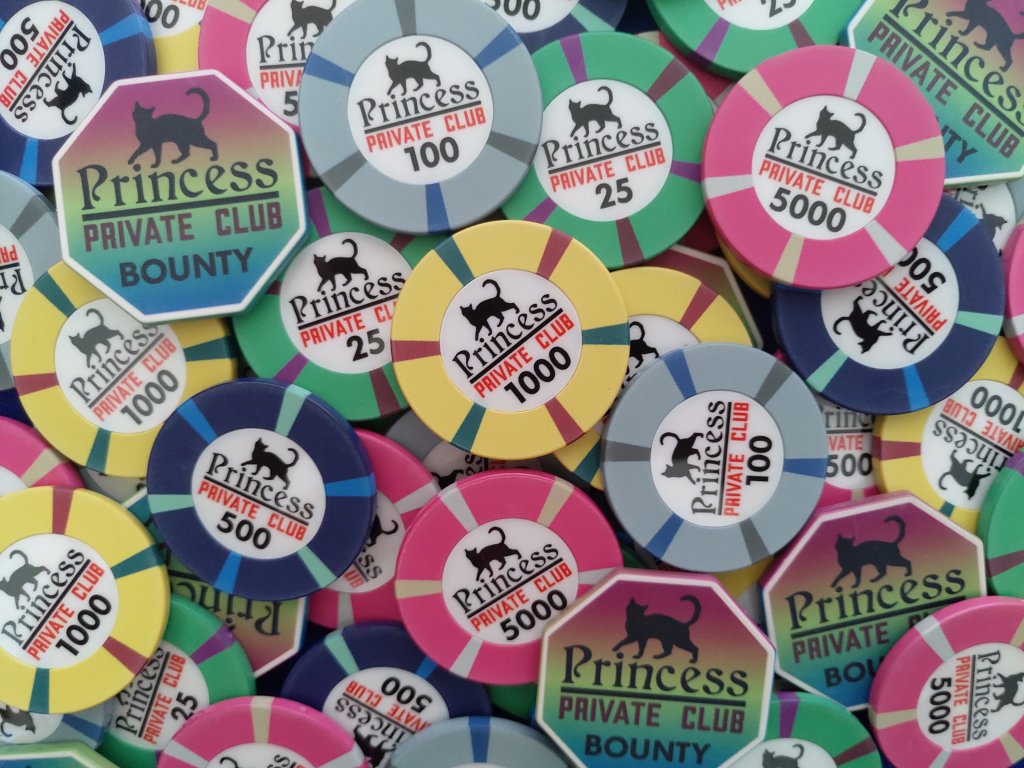
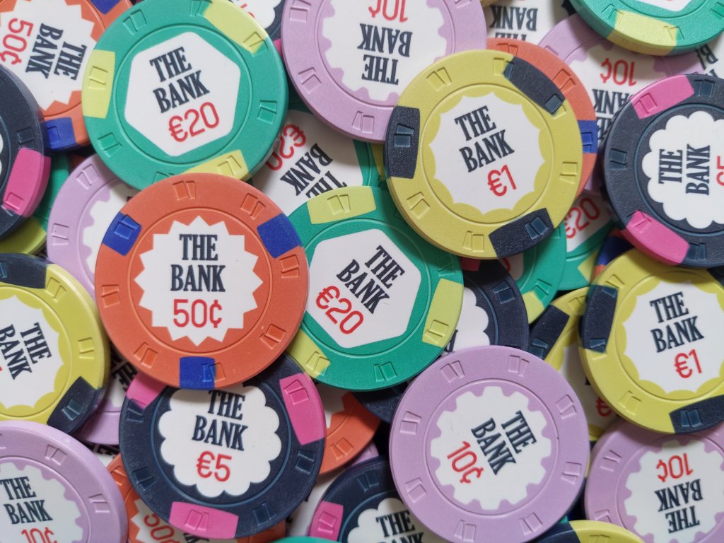
For the PRESTIGE design set, Woody provided us Pantone code, and the match is perfect, you don't need to worry about the color variation. I'd suggest you to look at the actual sample pictures to decide if you like the colors or not.


