Third time is a charm. Looking to build a CPC set. (5 Viewers)

Aggie930

Sitting Out
Joined
Nov 3, 2022
Messages
32
Reaction score
22
Location
Pittsburgh, PA
After a couple of attempts to put together a set, it was suggested that I essentially start over and design a chip at a time starting with the workhorse and then tweak them to make the set cohesive. So let’s give this a try.

At this point, I’d like to stick to more traditional colors, or just slightly different.

Frac: No significant opinion on color
$1: White, blue, maybe black
$5: Maroon, red
$25: Green, gray ($20)??
$100: open, likely won’t see felt. Maybe be ND

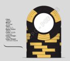
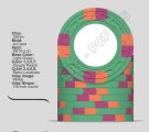
I did receive feedback that focused on the “Aggie” $5 chip. Since that was initial focus of the set, and part of my username, and will likely be one of the workhorse chips, might as well start there.

I see this being either maroon or red.
hh maroon 5.png
hh r red 5.png


Maroon is obviously the Aggie color, but I’m not sure I would just want white edge spots, and the main secondary color of gray doesn’t see to add much color. My original idea was to make if more colorful using spot colors from my daughter's school. I'm leaning away from that, but here is that idea:
maroon with red yellow.png

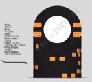
Red (above uses Retro, seems to be the better red) would allow the edge spots to be maroon and white and bring more color to the chip. I’m also planning to have a small tribute to the collapsed bonfire on the label, and red is often a symbol of fire (was reminded orange does not belong on a TAMU chip). Additionally, the second part of my username refers to my fun car that is red, so it would play there as well. Looking at the chip DB, most of the maroon chips have more colorful spots (Scarlet, Catus, Pineapple, Bottled in Bond, Chessie). I found several retro red base chips with maroon spots.

A&M has a tradition of the 12th man. I was thinking about using one of the 6x18 pattern to have 12 spots. While it is L8 or L10, the expense is ok, but I’m concerned that the progression to and after could be challenging without similar costs. I don't want a set of several L6+. The other spot patterns were just ideas, if not 6x18, I'm open, and perhaps keep it flexible as the $1 and $20 develop.

After this is narrowed down, I'll have a better idea on the direction for the $1.
 
As a fellow Aggie, I actually like the 4th maroon design above. To me it feels a little bit like looking at a football jersey with stripes on the shoulders, and one down the front. And I like the mix of gray and white, but that design might work with just white as well.

I can appreciate the striving for Aggie symbolism. I am working on a custom set related to the Army base I was born on, and my dad's military service and had to make a couple of choices like this to go with some less standard coloring. The main thing is to design the set for you and what you will be happy with, while trying to avoid things like dirty stacks.

BTW...what class?
 
Do you have a CPC color sample set? Maroon is a very dark color, it doesn’t feel like a deep red, more like a dark brown. Make sure it’s the color you want for a base color of the workhorse chip.
Have samples and that is one of reasons I started looking at red with the maroon and white spots. Not sure I wanted a chip that dark. Wish I could blend maroon and red.

As a fellow Aggie, I actually like the 4th maroon design above. To me it feels a little bit like looking at a football jersey with stripes on the shoulders, and one down the front. And I like the mix of gray and white, but that design might work with just white as well.

I can appreciate the striving for Aggie symbolism. I am working on a custom set related to the Army base I was born on, and my dad's military service and had to make a couple of choices like this to go with some less standard coloring. The main thing is to design the set for you and what you will be happy with, while trying to avoid things like dirty stacks.

BTW...what class?
I was also thinking basing it off the different jerseys. One as a gray base with maroon and white strips or white with marron and have it as $1. But I have other ideas for the $1 and nothing else for the $5. At least for now.

Class of 93. Went back for the first time last year when my wife ran the marathon there. Wow has it changed. Lived in Dallas until 2009 and always thought we would go back for a game or something and never got around to it.

Yourself?
 
Class of '93 here as well. graduated in Dec. 94, had to enjoy it as long as I could. Moved out of there for the last time in '96, but go back several times a year. My wife is class of '97 and we have season tickets. And I try to go down a few times for baseball as well.

And you are right, it has changed a lot, and in my opinion, most of the changes have not been for the better.
 
If you're going with a brighter red, I don't think you need white inserts, save that to brighten your black 1 maybe.

I went with this insert on my $5 and I think its great for the denom. I think maroon and arc yellow fit well.

1727717578195.png
1727717626873.png


Here is where I would start with creation, just base colors

1727717958763.png

1727717971475.png


Then add in your primary chip

1727718009505.png

1727718018658.png

1727718025603.png


Also I get you're going for a Texas A&M theme, but sometimes you have to decide if you want to stick to your theme colors or maybe create a better chip set.

Also instead of sticking with a color because of the name, and not the actual color, may not be the best for the set.
Consider The Bard's 'a rose by any other name would smell as sweet.'

and go with red as it seems to be the closest

1727718731019.png

1727718903118.png
 
Last edited:
Thanks for the feedback. I’ll check some other colors.

Also instead of sticking with a color because of the name, and not the actual color, may not be the best for the set.
Consider The Bard's 'a rose by any other name would smell as sweet.'

and go with red as it seems to be the closest
Not sure how you got the impression I chose the color based on the name. Looking at the samples, I think maroon contrasted better with retro and mandarin red than the standard red. Additionally, several others used that combo. I thought there wasn’t much use in recreating the wheel. Regarding the last mockup, I doubt I’ll choose a level above L6 without good reason.

Did I misconstrue what you meant?
 
I'm going to wait on whether or not to replace the white spot on the 5. Planning on using yellow spots on the black 1 to represent Pittsburgh, and maybe on the green 25. I thought by using a color twice might help tie the set together. Here are the other two chips.

Would using different yellows on the back be better. Initial idea is to us the DG to brighten it up.

I like the R. Lav spot on the green. Not sure about which yellow/orange. Peach? I thin Tiger might be too much?

hh 1 5 25.png
 
Thanks for the feedback. I’ll check some other colors.


Not sure how you got the impression I chose the color based on the name. Looking at the samples, I think maroon contrasted better with retro and mandarin red than the standard red. Additionally, several others used that combo. I thought there wasn’t much use in recreating the wheel. Regarding the last mockup, I doubt I’ll choose a level above L6 without good reason.

Did I misconstrue what you meant?
It could be I misconstrued what you meant. At any rate your offense at me getting the wrong impression and your decisiveness shows that you’re on the right path, it’s progress.
 
Have samples and that is one of reasons I started looking at red with the maroon and white spots. Not sure I wanted a chip that dark. Wish I could blend maroon and red.


I was also thinking basing it off the different jerseys. One as a gray base with maroon and white strips or white with marron and have it as $1. But I have other ideas for the $1 and nothing else for the $5. At least for now.

Class of 93. Went back for the first time last year when my wife ran the marathon there. Wow has it changed. Lived in Dallas until 2009 and always thought we would go back for a game or something and never got around to it.

Yourself?

If you look at the Chessies set, the 5 is a maroon, and it’s really nice, maybe the best chip in the set. I think you just need good complementary colors with it.
 
What are your thoughts on thicker edge spots?

I think if for the $1, you use a 314 or a 312 pattern and for the $25 you use a 4D14 it could add to the “spot progression” while still keeping the $5 special.

Also personal preference I like the 6D18 a bit more than 6DS18 for your $5 but you might not.
 

Attachments

  • IMG_0823.jpeg
    IMG_0823.jpeg
    104.6 KB · Views: 4
  • IMG_0824.jpeg
    IMG_0824.jpeg
    132.9 KB · Views: 5
Im partial to a maroon chip and the 5k in my tournament set is one of my favorites. It is stunning in person. I think if you want a maroon chip you should absolutely do it but you just have to be careful not only with the spot colors but also the spot pattern as well because it needs to look cohesive. Just playing around with some of colors:


1727991067146.png


1727991097635.png


1727991119377.png


1727991160213.jpeg
 
I'm not opposed, but concerned that the $5 would look out of place instead of special. I had 3d14 for the $1 and 4DSA16 for the $25 at one point, but thought having the spots more similar looked better. I like the 6DS18 on the $5 so it has 12 distinct spots instead of 6 two-colored spots. But that decision took a while. I was struggling a bit with the $25 and found a new theme for it, the 6D18 naturally fit. Without wanting two patterns the same, it made the decision easy. I'll
hh test different spots.png


Definitely something to think about. Thanks
 
Im partial to a maroon chip and the 5k in my tournament set is one of my favorites. It is stunning in person. I think if you want a maroon chip you should absolutely do it but you just have to be careful not only with the spot colors but also the spot pattern as well because it needs to look cohesive. Just playing around with some of colors:
I went into the project focused on the $5. My first idea was close to what I have presented (not Level 10). After seeing several maroon chips, I started down that path. As I started working on it I decided I also wanted a Black chip in play. I have been cursing @SeanGecko a lot since then. It is probably more for my group than myself. Also, using a red base for the "Aggie" chip, nails my username. The 930 part of my UN: https://www.pokerchipforum.com/thre...-you-have-had-want.58510/page-14#post-2469265

Besides, don't we need secondaries?
 
Jumping back a bit to your question earlier…
Would using different yellows on the back be better. Initial idea is to us the DG to brighten it up.
I’m not 100% sure it would. If you’re going for a Steelers vibe maybe we could do something like this. It would match their alt uniform. Maybe find the closest color match (canary vs DG yellow vs DG arc yellow) to the uniform and it could be a really cool idea.

This edge spots pattern would match your Aggie $5 a bit better than my previous suggestion too.
 

Attachments

  • IMG_0825.jpeg
    IMG_0825.jpeg
    101.9 KB · Views: 6
Jumping back a bit to your question earlier…

I’m not 100% sure it would. If you’re going for a Steelers vibe maybe we could do something like this. It would match their alt uniform. Maybe find the closest color match (canary vs DG yellow vs DG arc yellow) to the uniform and it could be a really cool idea.

This edge spots pattern would match your Aggie $5 a bit better than my previous suggestion too.
I'm shooting for more of just Pittsburgh vibe over just steelers, but it seems one and the same. An earlier chip had the yellow, red and blue from the helmet logo or using orange instead of red which was the original Steelmark logo that was the origin. I decided to downplay the steelers and eliminated the Cowboys chip. I probably going make it as a secondary chip and bring it out during the season.

steeler chip.png
steeler orange double.png
 
Here are the two ideas with the frac idea. The theme behind it is my grandfather that served in the air force in WW2, Korea, and Vietnam. The highest metal he was awarded was the Distinguished Flying Cross. No idea how noteworthy it is, but gave me the idea for a frac:
Dfc-usa.jpg
strips or spots.png
 
No worries, just trying to throw out some extra mock ups for you to try and see how you like it.

Never been to Pittsburg myself so I can’t really comment on the vibe of the city. I’m trying to mix what I know (football) vs what I think might look good for a lower denomination chip.
 
No worries, just trying to throw out some extra mock ups for you to try and see how you like it.

Never been to Pittsburg myself so I can’t really comment on the vibe of the city. I’m trying to mix what I know (football) vs what I think might look good for a lower denomination chip.
Understand and appreciate it. Pittsburgh, beat expectations by a long shot. It took a while, and as a Cowboy's fan in the late 70s was the last place I thought I would ever live.
 

Create an account or login to comment

You must be a member in order to leave a comment

Create account

Create an account and join our community. It's easy!

Log in

Already have an account? Log in here.

Back
Top Bottom