Toms Poker Club CPC Cash Game Set (2 Viewers)

Yeah, all food for thought. We’re all just passing along our knowledge. It’s hard to know how to balance everything and what the perfect answer it. But it’s a fun adventure!

You know… you can also get a dedicated micro set from Tina or another Alibaba vendor for you/your sons… :)

Sorry about the $/€ mixup. I was in a few threads and mixed you up. Apologies.
No need to apologize, Warma. It was me who only mentioned $. I just prefer $ on chips although our currency is €. ;)
Thank you!
 
Your file is correct… what I meant to say was that the yellows in the design tool don’t accurately represent the yellows that CPC produces. I purchased a DG yellow base and found it much lighter than expected. Most people love the TRK and Paulson yellows, but the CPC yellows are different. You’ll see when you get your samples- I just don’t want you falling in love with a Paulson yellow and expecting the CPC yellow to be the same.

Here’s a quick look: left to right are CPC yellow, CPC canary, TRK yellow, CPC DG yellow. Most people want the TRK yellow, but you can’t get it with CPC.
View attachment 1177297
(Having said that, the CPC yellows can look great if used properly.)

View attachment 1177299
Same light… on the left, I think the DG yellow works and the canary and DG Saturn don’t. On the right, I like the yellow NRPY and the canary on the Club, but the DG yellow on the California Gold didn’t turn out the way I wanted (too light) and has bothered me since it arrived.
This. All of this.

I did a dg yellow $5 on my first CPC set and I’ve just never loved how it turned out. The fact that the set sits on my shelf next to several Paulson sets with yellow chips probably doesn’t help that.
 
This. All of this.

I did a dg yellow $5 on my first CPC set and I’ve just never loved how it turned out. The fact that the set sits on my shelf next to several Paulson sets with yellow chips probably doesn’t help that.
Hi cpac54, could you please post a foto with a comparison of both colors?
Thanks
 
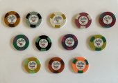
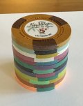
Got my samples from CPC today. Will help making decisions on base colors and spots and molds of course :cool
IMG_2832.jpg
 
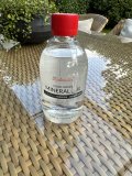
what a difference! I knew I should get oil, but don`t have it yet. Not sure what and where to buy (in Germany) :unsure:
I found it in Iceland under some different name in a pharmacy. Just be sure there is no smell of the oil ☺️
 
Yesterday I got my oil and another sample set from Key West.
...and still working on colors and spots layout, not speaking of the inlay which is still a lot of work...
IMG_2852.JPGIMG_2849.jpg
 

Attachments

  • IMG_2850.jpg
    IMG_2850.jpg
    114.3 KB · Views: 80
Thanks for the pictures. I have not ordered samples yet, but I have quite a few experiments in the Design Tool with DG Saturn that I like, and having read multiples times than it has a bad rep, I am pleasantly surprised how it looks in your photos.

Yellows are indeed… "special" :rolleyes:
 
Thanks for the pictures. I have not ordered samples yet, but I have quite a few experiments in the Design Tool with DG Saturn that I like, and having read multiples times than it has a bad rep, I am pleasantly surprised how it looks in your photos.

Yellows are indeed… "special" :rolleyes:
No one should order DG Saturn without seeing it in person, preferably as a spot on a chip if ordering as such.

But I’m one of the few that likes the CPC yellows- if used properly.
 
Oh yes definitely, but I am always expecting some kind of weird glaucous tint, and here it looks almost like a nice tender green. I'll wait to see it in person, but I am pretty sure I'll find a place for it.

I am sure Yellows can work. If you do no expect yellow… :ROFL: :ROFLMAO: More seriously though, I have seen countless examples of splendid chips with these yellows. I think part of the "problem" is semantic, as yellow creates a certain expectation that is clearly not there, and CPC would be better off by giving some more poetic creativ terms to their colours. Sorry for the thread highjack.
 
Thanks for the pictures. I have not ordered samples yet, but I have quite a few experiments in the Design Tool with DG Saturn that I like, and having read multiples times than it has a bad rep, I am pleasantly surprised how it looks in your photos.

Yellows are indeed… "special" :rolleyes:
I recommend you get samples, it is best to keep them in your hands and see them under different light conditions. a photo does not show enough. I made my pictures under daylight 5 pm. I don`t know why DG Saturn turns out a bit green. I think my sample is more something like an orange, so anyway, best way to find out is to get samples.
 
Hi everyone and greetings to all Pokerchip Enthusiasts,
I have plans for a CPC cash game set I would like to share with you.
Please let me know what you think about it.
There are two designs. The first is simpler, and therefore also significantly cheaper to buy.
The second somewhat more complex (also better/nicer?)
Right now at the start I am thinking about the color scheme and the spots.
I have already decided on the basic colors for $1, $5, $25 and $100:
Blue, red, green, black. One could consider which blue, red, green.
I know you don't need $25 AND $20. But I like the yellow in the Aurora Star set, for example, which I first noticed in a YT video by Chris Manzoni. Thank you Chris for your videos! A good inspiration. So why not have both $25 and $20?
The inlays should be black. The final layout is still open. I tend towards a rather simple look like the poker chips in the Aria where I have played a lot.
Which mold? I do not know yet, so I planned just with the plain mold. With 1 inch inlay it is not so bad, is it?
Which version do you like better? What could be done better?
Both praise and harsh criticism are welcome.;)View attachment 1177274View attachment 1177275
These are some great and helpful color combinations. Trying to go down the rabbit hole of deciding and designing my first Cash set.
 
I'm still working on this set. These are two of my most recent designs (black or white inlay?). I still lack ideas for the inlay design.

TPC 1.png
TPC 2.png
 
.25 - nice, no complaints.
$1 - I like. Just know that white base color on the workhorse chip could lead to frequently having to clean a lot of chips.
$5 - CPC has a lot of yellow options and I don't like any of them. Arc yellow and peach are very nice colors though.
$25 - very nice!
$100 - I like it, just know that you have a pretty bright accent on your $25. The hundo looks a bit muted in comparison and breaks the progression a little bit.
Non denom - try Arc yellow base color and I'm on board.

At this stage of the lable design I prefer the black bg. That is mostly because the white lable is pretty empty. I'd probably change my mind with a nicer design on the white bg.
 
Last edited:
As Angelo mentioned, the yellow colors all doesnt look any good. If you need a color sample, i'm more than happy to lend it to you, but i also offered it to Angelo, so you guys can discuss who gets them first. :ROFL: :ROFLMAO:

Personally i'm not a big fan of the V-spots. But overall i like the color scheme.

For the inlay, i would throw a grey based option into the consideration.
Thanks Fabo,
I have all CPC color samples.
I will consider grey, maybe dark grey (?) for the inlay
 
.25 - nice, no complaints.
$1 - I like. Just know that white base color on the workhorse chip could lead to frequently having to clean a lot of chips.
$5 - CPC has a lot of yellow options and I don't like any of them. Arc yellow and peach are very nice colors though.
$25 - very nice!
$100 - I like it, just know that you have a pretty bright accent on your $25. The hundo looks a bit muted in comparison and breaks the progression a little bit.
Non denom - try Arc yellow base color and I'm on board.

At this stage of the lable design I prefer the black bg. That is mostly because the white lable is pretty empty. I'd probably change my mind with a nicer design on the white bg.
Thanks Angelo,
I have to admit, I am not so happy with the hundo so far
 
To be honest, I don’t see any reason why the $100 chip bothers you. I find all the chips except the yellow one amazing. But this is probably because I always have difficulties with $1000...
I definitely like black labels. But, if I understand correctly, this is just a crude version...
 
To be honest, I don’t see any reason why the $100 chip bothers you. I find all the chips except the yellow one amazing. But this is probably because I always have difficulties with $1000...
I definitely like black labels. But, if I understand correctly, this is just a crude version...
Thanks @maxim_666666
maybe I´ll keep the $100 as it is:love:
The yellow is somehow a relict of my first layouts, I wanted to have a yellow chip in my set and it used to be a $20 but I decided not to have $20s AND $25s.
Now it is intended as a goodie for my players (membership token)
and yes, it is a crude version
 

Create an account or login to comment

You must be a member in order to leave a comment

Create account

Create an account and join our community. It's easy!

Log in

Already have an account? Log in here.

Back
Top Bottom