Thisfiendis138
Full House
D 

I personally like B and D the best. Leaning towards B. Smile, clean and makes a statement…..
As pictured, I like B the best. While I like D, something is throwing me off with the text that I cannot pinpoint. I wonder how it would look straightened instead of curved like it's going on an inlay.
This looks great!!That's a good point. You could also try Animal on the left of the logo and House on the right of the logo. That might look pretty sweet.
EDIT: Attached a quick mockup of it. Of course I don't know what font you had. I like your font much better. This would need a little bit better alignment.
I like this one too. I would consider making the Animal House text in the darker gray color, that way the graphic still stands out a little more. Cool design.That's a good point. You could also try Animal on the left of the logo and House on the right of the logo. That might look pretty sweet.
EDIT: Attached a quick mockup of it. Of course I don't know what font you had. I like your font much better. This would need a little bit better alignment.
I like this one too. I would consider making the Animal House text in the darker gray color, that way the graphic still stands out a little more. Cool design.
I think centering the logo would be best. Maybe play with the kerning with both words to make “Animal” slightly narrower and “House” slightly wider to balance?
These are awesome! I have already reached out to Tony/Ray. I am going to go with this new version. This is just another reason why this forum is great! Thanks much!
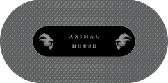

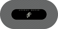
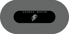
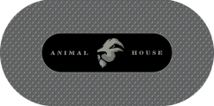
These are awesome! So much to think about. Thanks for doing this!Okay okay... I really like the logo and am having fun playing around. Threw a couple others together. I'll stop now!
I think the Dual Logo is a little busier, but if you are using a dealer it gives a more natural spot for the house cards. Also I like the bigger logo with the text on both sides more than the text up top. I feel like there is too much empty space around the logo with just text up top.
The samples appear as slippery the matsuis. The colors are really nice thou.What do you think of their sample chips? Do different models / lines / versions feel different?
you need to get yourself a shuffle stack / barrel from the abbiati gbs. my sample sets are not as slippery as mastuis.The samples appear as slippery the matsuis. The colors are really nice thou.
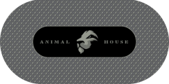
looks great but i think there is an opportunity to do something with the letters or the background space. seems a little too plain atm. how about some sort of animal print or claw marks layered over the top of it to give it a bit of pop/textureThanks to everyone who voted, and special thanks @Rymack10 For coming up with all the options and creating the new felt design! I am gonna send you a thank you gift. PM coming. Final answer:
View attachment 848137
Could incorporate that into the cross hatch pattern, alternating with the lion head.looks great but i think there is an opportunity to do something with the letters or the background space. seems a little too plain atm. how about some sort of animal print or claw marks layered over the top of it to give it a bit of pop/texture
View attachment 848138 View attachment 848139
https://www.pokerchipforum.com/threads/custom-poker-table-felt-thread.6655/
some more inspo in there
Yeah that'd be really cool and could help keep from having too many lion heads on the mat.Could incorporate that into the cross hatch pattern, alternating with the lion head.
Could incorporate that into the cross hatch pattern, alternating with the lion head.
