You are using an out of date browser. It may not display this or other websites correctly.
You should upgrade or use an alternative browser.
You should upgrade or use an alternative browser.
Sale Made-to-order Custom Table Toppers (67 Viewers)
- Thread starter rjdev7
- Start date
jamesjkim
Flush
Looks great. I'm considering similar for my HSI set too!
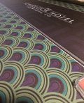
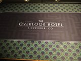
New topper for the pub table came in today. Looks great, thanks to @aaron2786 .
View attachment 1202134
View attachment 1202136
ngmcs8203
Flush
Love the design.A few shots of the new horseshoe top at @deskjob101 place
View attachment 1203601View attachment 1203602
Yes I can alter the color on whatever topper you choose. Just send me a private message and we can work out the details.I want to order the John Wick/Continental for my barrington. For some of the “stock designs” can you do things like alter color? I want a dark or black mat and there weren’t many shown, thanks!
Well, why not. If you want some feedback, here's a few I would suggest.Hey guys, not sure this is the right place for it but I made my first attempt at designing a topper and would love some feedback on it.View attachment 1205652
1. The ends of your oblongs (betting area) look off, they're not smooth transitions from side to rounded end, I'd look into that.
2. I think your color choice is fine, but two suggestions, within some of the lines (yard tho trees) you have a interior glowing line wuthin some of them and not inside of spot others. Do one, or the other, not both. Additionally, while the reds make for a decent contrast to the green and blue, I think I'd keep it all on the cool spectrum, maybe use white for the red areas.
3. Idk what that Chevron looking part at the bottom of the logo is, but I'd lose it, it'll look cleaner
4. Dats a big azz logo lol, I usually try and keep it to no more than 2/3rd the height of the betting area, its a focal point, not a flag.
Some minor clean up, some simplification, you'll be on a good track
Try thisHey guys, not sure this is the right place for it but I made my first attempt at designing a topper and would love some feedback on it.View attachment 1205652
Thanks for the feedback! I just downloaded a program to play around with it and am still learning. Really appreciate it.Well, why not. If you want some feedback, here's a few I would suggest.
1. The ends of your oblongs (betting area) look off, they're not smooth transitions from side to rounded end, I'd look into that.
2. I think your color choice is fine, but two suggestions, within some of the lines (yard tho trees) you have a interior glowing line wuthin some of them and not inside of spot others. Do one, or the other, not both. Additionally, while the reds make for a decent contrast to the green and blue, I think I'd keep it all on the cool spectrum, maybe use white for the red areas.
3. Idk what that Chevron looking part at the bottom of the logo is, but I'd lose it, it'll look cleaner
4. Dats a big azz logo lol, I usually try and keep it to no more than 2/3rd the height of the betting area, its a focal point, not a flag.
Some minor clean up, some simplification, you'll be on a good track
And just like that he drops another killer design. I love this!
Yours if you want it, it's your idea anywayThanks for the feedback! I just downloaded a program to play around with it and am still learning. Really appreciate it.
And just like that he drops another killer design. I love this!
I did a Dunes, but the logo blown up so large doesn't really look well for a top, so I tried a retro look as well, still not a fanHi guys, first post here!
Would like to know if someone would have access to any of the Dunes logo/visuals vectors or assets so I could make a custom felt here.
LMK! Thanks!
Embrace the golf theme with the first design. light green (putting green) in the playing area. Darker green (rough) in the outer area. Golf balls, criss-crossing clubs, flags instead of the suits.
Sure, if they had asked for that, you're welcome to the fileEmbrace the golf theme with the first design. light green (putting green) in the playing area. Darker green (rough) in the outer area. Golf balls, criss-crossing clubs, flags instead of the suits.
You really can't help yourself, can you? Your post made it seem like you didn't like either of these designs. So I made a few suggestions.Sure, if they had asked for that, you're welcome to the file
And you still come at me with a reply that makes it seem like my suggestions are unwelcome. I'm so done with you.
Dude, you've got a real persecution complex.You really can't help yourself, can you? Your post made it seem like you didn't like either of these designs. So I made a few suggestions.
And you still come at me with a reply that makes it seem like my suggestions are unwelcome. I'm so done with you.
Do you want me to break down my response to your suggestions?
"Sure"
(That's fine)
"If they had asked for that"
(It's not golf themed because they didn't ask for it - also it was just a post for the guy that asked for graphics)
"You're welcome to the file"
(If you'd like to run with the idea, here, take my work and do what you will with it)
Now, which part did you take as a personal slight today? Man, you have less chill than a broken fridge.
I did a Dunes, but the logo blown up so large doesn't really look well for a top, so I tried a retro look as well, still not a fan
View attachment 1206076View attachment 1206077
Thanks for the reply bud!
Could you kindly give me access to vector you used in the first one? (the logo)
TY!
You’re on to something there, whether it’s a Dunes theme or something for a golf-lover. I like how you build and add on ideas to move them forward.Embrace the golf theme with the first design. light green (putting green) in the playing area. Darker green (rough) in the outer area. Golf balls, criss-crossing clubs, flags instead of the suits.
Kinda wish I liked either Dunes or golf to work on this.
Send me a message and I will get it to youThanks for the reply bud!
Could you kindly give me access to vector you used in the first one? (the logo)
TY!
Will do - thanks mateSend me a message and I will get it to you
How do you like the plying surface with the topper on there? Better or worse than the stock? (Padding specifically)New topper for the pub table came in today. Looks great, thanks to @aaron2786 .
View attachment 1202134
View attachment 1202136
ngmcs8203
Flush
Wayyyy betterHow do you like the plying surface with the topper on there? Better or worse than the stock? (Padding specifically)
Moybueno
Waiting List
Can anyone make a Milano's themed table topper? Looking for ideas for my cash games
EL_Grande85
Pair
I need help with a design. Anyone besides Aaron or Ryan able to help? It sounds like they are both pretty well swamped...
blueshells50
High Hand
topper came in its great i knew it would be smaller than the table but i didnt trust my own measuring abilities and knew if i had to trim it, id fuck it up. Cant even really notice the difference when you are sitting at table level and cards fly across it!
Glad it arrived safely! Hope you enjoy it.
blueshells50
High Hand
topper came in its great i knew it would be smaller than the table but i didnt trust my own measuring abilities and knew if i had to trim it, id fuck it up. Cant even really notice the difference when you are sitting at table level and cards fly across it!
Attachments
Similar threads
- Replies
- 1
- Views
- 420
Reshipping (ordering closed)
Table Toppers - Group Buy
- Replies
- 423
- Views
- 23K
- Replies
- 16
- Views
- 601


