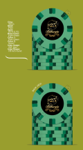
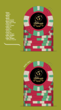
Not by me but feel free to use these designs if you like.Is there a GB in the works?
Post mockups for fun/science? (42 Viewers)
- Thread starter lherron
- Start date
chipinla
Straight Flush
- Joined
- Apr 12, 2018
- Messages
- 8,346
- Reaction score
- 23,543
I’m not sure how well that pot of gold will transfer into a hot stampI'm likely never going to own a playable set of Gulfports, so I'm going for a CPC tribute set instead.
I know I'll not get any creativity/style points for the 1,5,20,100...so be it.
Looking for input for the fracs and $2 chip (for limit games)....breakdown will be 10c (inspired by snapper), 25c, 1, 2 (inspired by 500), 5, 25, 100.
Working on a hot stamp...see below.
View attachment 1111486
View attachment 1111489
Agreed…trying to make it larger (maybe less complex). Going to hopefully get a couple test stamps going…I’m not sure how well that pot of gold will transfer into a hot stamp
chipinla
Straight Flush
- Joined
- Apr 12, 2018
- Messages
- 8,346
- Reaction score
- 23,543
Possible V2 for Andy & Red’s Casino Cruises with a nickel added to the lineup.

chipinla
Straight Flush
- Joined
- Apr 12, 2018
- Messages
- 8,346
- Reaction score
- 23,543
I’m revisiting my Rounder’s tribute for the Judge’s game.


Back burner project: alt set of KGB's....
ChipReeseG
High Hand
https://www.pokerchipforum.com/thre...-custom-bellagio-inspired-chip-design.104176/
Hey guys posting this here, need any help I can get!
Hey guys posting this here, need any help I can get!
Got a shuffle stack of CSQ the other week that convinced me I definitely need another CPC set at some point. Luckily, I have nothing I want to sell and can’t really spare any other funds towards this (perhaps if I was single).
So, plenty of time to screw around with the designer. Got a few down that I like but not completely sold on anything besides the hundo. Inlays are just place holders, thinking something classy looking for the actual design but nothing decided. Any ideas/pointers?


So, plenty of time to screw around with the designer. Got a few down that I like but not completely sold on anything besides the hundo. Inlays are just place holders, thinking something classy looking for the actual design but nothing decided. Any ideas/pointers?
chipinla
Straight Flush
- Joined
- Apr 12, 2018
- Messages
- 8,346
- Reaction score
- 23,543
Very nice! I think it’s challange enough to get a line-up of 5 denoms looking good. Great job!Everyone loves tropics, right? Right? Label's too busy, but I'm just mocking for now , so anyway 5c to 5K
View attachment 1120495View attachment 1120496
Maybe getting rid of the green would clean the inlay up to look less busy.
Thanks, and for certain it would, but I wanted as many colors as I could stick on first so I can decide what I want or need to subtract piece by pieceVery nice! I think it’s challange enough to get a line-up of 5 denoms looking good. Great job!
Maybe getting rid of the green would clean the inlay up to look less busy.
BillyBrooks
Sitting Out
Over the past few months, I've played with the design tool minimum weekly, dreaming of ordered my own chips for micro stakes home games, and here is what I've settled with.
My old home games in Sydney were in a friend's garage, his name was Bill so the game was called the Billargio. In order to make the game look bigger, we had the following chip denominations from a cheap AK Suited - 50c (white) $1 (red) $2 (green) $5 (blue) $10 (black). I now what something a little more traditional, but also unique enough to be ours.
50c - since it's not really a typical denomination, I felt like colour was open to whatever I wanted. This one is the Hawthorn Hawks colours, my Australian football team,
$1 - has to be white, and obviously the same as the $5k Aria chips used on HSP. Reminds me of the days multi-tabling Full Tilt with HSP torrent videos running in the corner.
$5 - standard red, but kept the green and white as in the old home games a standard opening raise was $3.50, called a Pizza because it was a red, white and green chip like the Italian flag.
$25 - needed one bigger denomination because the game is a little bigger after 15 years. I think this design looks like a watermelon, so that's likely what they will be called.
The logo is copy/paste together that my zero graphic design skills could muster. I keep going back and forth between gold on black or black on gold (like my profile image). Still not sure which is better.
So, when I have a spare $600 to bunk off, I guess these will become real.
Attachments
chipinla
Straight Flush
- Joined
- Apr 12, 2018
- Messages
- 8,346
- Reaction score
- 23,543
Looks good. The one suggestion I would make is using retro red instead of mandarin red. Not sure if you have any color samples but retro red is your more traditional
Red.
Also, do you know how to save all of the chips as one picture so you can see the lineup all together?
Red.
Also, do you know how to save all of the chips as one picture so you can see the lineup all together?
BillyBrooks
Sitting Out
I do not. I gave it a go, but it took longer than 10s to figure out so I gave up.Looks good. The one suggestion I would make is using retro red instead of mandarin red. Not sure if you have any color samples but retro red is your more traditional
Red.
Also, do you know how to save all of the chips as one picture so you can see the lineup all together?
I don't have any colour samples, just going off what's on the screen and playing around. I'll have a look at that option.
chipinla
Straight Flush
- Joined
- Apr 12, 2018
- Messages
- 8,346
- Reaction score
- 23,543
Save each chip as a new chip then do this:


If you’re serious about going the CPC route, I highly recommend getting a sample set - some colours look very different in person vs the online tool.I do not. I gave it a go, but it took longer than 10s to figure out so I gave up.
I don't have any colour samples, just going off what's on the screen and playing around. I'll have a look at that option.
BillyBrooks
Sitting Out
And I just figured it out.Looks good. The one suggestion I would make is using retro red instead of mandarin red. Not sure if you have any color samples but retro red is your more traditional
Red.
Also, do you know how to save all of the chips as one picture so you can see the lineup all together?
I doubt I would go the CPC, too expensive to Australia. They work out to about $6/chip once you factor in postage. Card moulds or similar work out to about 90c/chip.If you’re serious about going the CPC route, I highly recommend getting a sample set - some colours look very different in person vs the online tool.
chipinla
Straight Flush
- Joined
- Apr 12, 2018
- Messages
- 8,346
- Reaction score
- 23,543
There’s also this reference on the CPC website. While it’s better than the chip design tool it’s still not as good as chips in handIf you’re serious about going the CPC route, I highly recommend getting a sample set - some colours look very different in person vs the online tool.
http://www.classicpokerchips.com/pokerchips/realclay/colorchart.htm
chipinla
Straight Flush
- Joined
- Apr 12, 2018
- Messages
- 8,346
- Reaction score
- 23,543
Not chips but going to give these cards a shot and see what the quality is like.

BillyBrooks
Sitting Out
Nice - if it were mine though, I might rotate that logo 90 degrees and have less blank space.Not chips but going to give these cards a shot and see what the quality is like.
View attachment 1121076
chipinla
Straight Flush
- Joined
- Apr 12, 2018
- Messages
- 8,346
- Reaction score
- 23,543
That would look really really odd. I can’t think of one set of cards I’ve ever seen with a logo longways. I would never do that but would love to see some of you have examples.Nice - if it were mine though, I might rotate that logo 90 degrees and have less blank space.
BillyBrooks
Sitting Out
I don't have any examples online, it is not very common to have them landscape instead of portrait, but to be honest that is what makes me like it more. But it's just personal preference, no offence meant.That would look really really odd. I can’t think of one set of cards I’ve ever seen with a logo longways. I would never do that but would love to see some of you have examples.
I can think of a lot of examples though that have the logo top and bottom of the card, when the logo is wider than it is tall. I don't know if that'll work well with Biff, it's a more detailed logo than say WSOP etc.
chipinla
Straight Flush
- Joined
- Apr 12, 2018
- Messages
- 8,346
- Reaction score
- 23,543
No offense takenI don't have any examples online, it is not very common to have them landscape instead of portrait, but to be honest that is what makes me like it more. But it's just personal preference, no offence meant.
I can think of a lot of examples though that have the logo top and bottom of the card, when the logo is wider than it is tall. I don't know if that'll work well with Biff, it's a more detailed logo than say WSOP etc.
chipinla
Straight Flush
- Joined
- Apr 12, 2018
- Messages
- 8,346
- Reaction score
- 23,543
V2… much much better. Thanks for the suggestion @AlbinoDragonNot chips but going to give these cards a shot and see what the quality is like.
View attachment 1121076
BillyBrooks
Sitting Out
http://www.pokerchipdesigntool.com/This are awesome! What tools are y'all using to create the poker chip color designs? Is there a template?
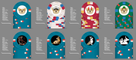
I'm playing around with this design tool and so far I'm trying to design on a design with progressing art or a single design on all chips. What do y'all prefer? I still need to fine tune the design with values and figure out the size and if I want a border but here is a rough draft of what I'm thinking.

Attachments
Last edited:
chipinla
Straight Flush
- Joined
- Apr 12, 2018
- Messages
- 8,346
- Reaction score
- 23,543
A couple suggestions to clean up your mock a little. Change the background to grey and change the setting so you don’t have to see both sides of the chip since they’re the same.I'm playing around with this design tool and so far I'm trying to design on a design with progressing art or a single design on all chips. What do y'all prefer? I still need to fine tune the design with values and figure out the size and if I want a border but here is a rough draft of what I'm thinking.
View attachment 1122040
I just edited my original post. Is that what you meant?A couple suggestions to clean up your mock a little. Change the background to grey and change the setting so you don’t have to see both sides of the chip since they’re the same.
Similar threads
- Replies
- 12
- Views
- 476
- Replies
- 97
- Views
- 10K
- Replies
- 169
- Views
- 25K
- Replies
- 10
- Views
- 2K

