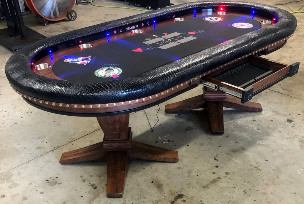
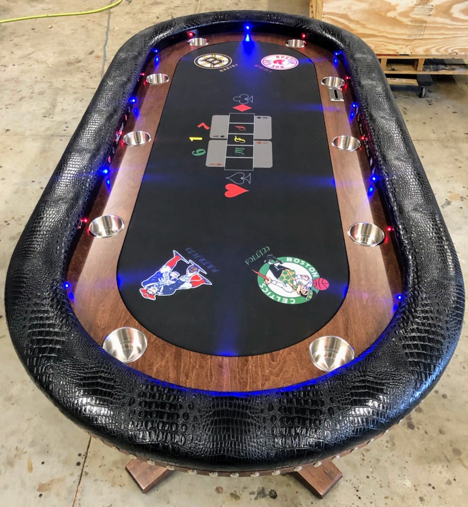
My 92×44 custom built by Keith at KandJ Poker Tables.
You are using an out of date browser. It may not display this or other websites correctly.
You should upgrade or use an alternative browser.
You should upgrade or use an alternative browser.
Table Showcase (pics) (34 Viewers)
- Thread starter RowdyRawhide
- Start date
WedgeRock
Royal Flush
Not a fan of Boston sports teams, but suited speed cloth with team logos instead of suits would've been badass.
Yeah I mulled that over. I decided to go with the above to keep the felt less "busy".Not a fan of Boston sports teams, but suited speed cloth with team logos instead of suits would've been badass.
WedgeRock
Royal Flush
I was thinking a subtle grey on the black background wouldnt be too busy. Look at high contrast suited speed cloth. It just all blends in.
My only concern would be the logos losing too much detail when reduced down to suited speed cloth size.
My only concern would be the logos losing too much detail when reduced down to suited speed cloth size.
Actually, yeah. That sounds like it might look nice. Seeds planted for when a felt replacement is due hahaI was thinking a subtle grey on the black background wouldnt be too busy. Look at high contrast suited speed cloth. It just all blends in.
WedgeRock
Royal Flush
If I've learned anything from this forum, it's that there is no need to wait until equipment (table, chips, cards) is nearing the end of it's useful life...
Check out the Mario SSC... That's what put the logo idea into my head.
EDIT: Stolen from @bentax1978's thread.
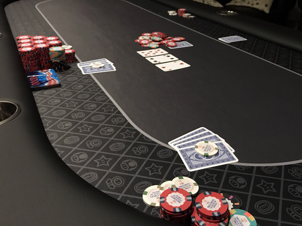
The beauty of this design is it puts the logos where it's easily observable by the player, but center field, where the cards and pot go, is clean. Unfortunately, it wouldn't work for your wooden racetrack table...
Check out the Mario SSC... That's what put the logo idea into my head.
EDIT: Stolen from @bentax1978's thread.
The beauty of this design is it puts the logos where it's easily observable by the player, but center field, where the cards and pot go, is clean. Unfortunately, it wouldn't work for your wooden racetrack table...
Last edited:
Yeah that is very sweet. I think I'll definitely try to have someone mock up a nice design when I'm ready to swap felts. My table is about 2 weeks old now and the felt has only been used twice so I'm definitely not ready to change it yetIf I've learned anything from this forum, it's that there is no need to wait until equipment (table, chips, cards) is nearing the end of it's useful life...
Check out the Mario SSC... That's what put the logo idea into my head.
EDIT: Stolen from @bentax1978's thread.

FordPickup92
Royal Flush
WedgeRock
Royal Flush
I think if the logos were monochrome, they'd look less like pajamas.
EDIT: I would have made center field look like a football field with the yard markings, etc. Would've looked better than faux SSC and been a little less busy.
EDIT 2: The other criticism I have is that with SSC, you can alternate the orientation of the image/logo so it's not upside down for half the table.
Last edited:
I think if the logos were monochrome, they look less like pajamas.
Lol I had same thought - looks like pjs!
I think if the logos were monochrome, they'd look less like pajamas.
EDIT: I would have made center field look like a football field with the yard markings, etc. Would've looked better than faux SSC and been a little less busy.
EDIT 2: The other criticism I have is that with SSC, you can alternate the orientation of the image/logo so it's not upside down for half the table.
Definitely agree, and I think that's why he veered away from that design.
I much prefer something like this for a football theme
Poker Zombie
Royal Flush
The only thing better than the racetrack racetrack is typing "racetrack racetrack", and it not being a typo.
AcesFull
Sitting Out
That black and gold table is my dream. Would look really good with a Saints fleur de lis in the middle lol.I personally really do not like stitches in a rail and will do anything I can to avoid it, but it's nearly 100% personal preference. However, some circumstances require stitches like real leather:
View attachment 75692
View attachment 75693
Or, in this case 2 different color vinyls: (ugh fuzzy photo)
View attachment 75694
Though real leather doesn't mean it HAS to have seams if the table is small enough or has a dealer cutout.:
View attachment 75699
View attachment 75700
Jesus. This is classy at it's finest. Amazing setup.A recent customer had his table in the crate for 2 weeks and finally got it setup and in it's new home. It matches their decor very nicely I'd say.
View attachment 310836
View attachment 310837
Simple and elegant. Chocolate colored leather for the rail was tough to do in 1 single piece. I was lucky to get a hide large enough to get it to fit.
It also has a matching solid oak dining table cover also in the black dye finish.
It also has a matching solid oak dining table cover also in the black dye finish.
Whew..... that leather is no joke price wise. Great table.Simple and elegant. Chocolate colored leather for the rail was tough to do in 1 single piece. I was lucky to get a hide large enough to get it to fit.
It also has a matching solid oak dining table cover also in the black dye finish.
A recent customer had his table in the crate for 2 weeks and finally got it setup and in it's new home. It matches their decor very nicely I'd say.
View attachment 310836
View attachment 310837
What an incredible setup. Just amazing. I am in the wrong line of work...
Poker Zombie
Royal Flush
Looking at the rest of the room, I'm guessing that the price was barely a concern.Whew..... that leather is no joke price wise. Great table.
Got that rightLooking at the rest of the room, I'm guessing that the price was barely a concern.
1A25R
Flush
EnjoyLife
3 of a Kind
A recent customer had his table in the crate for 2 weeks and finally got it setup and in it's new home. It matches their decor very nicely I'd say.
View attachment 310836
View attachment 310837
That is awesome!
- Joined
- Nov 22, 2018
- Messages
- 14,447
- Reaction score
- 30,906
- Location
- 129 West 81st Street, Apartment 5B
When are they hosted the meetup?Looking at the rest of the room, I'm guessing that the price was barely a concern.
A recent customer had his table in the crate for 2 weeks and finally got it setup and in it's new castle . It matches their decor very nicely I'd say.
View attachment 310836
View attachment 310837
Fyp
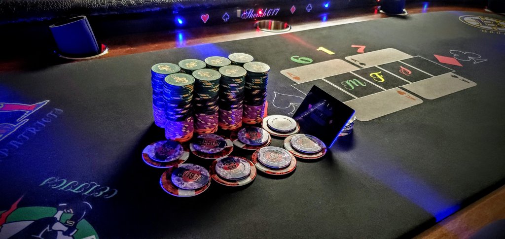
Ran a T7500 tourney today. Had a blast. Came in first in terms of chip lead but did an equity split with second. Hoping to really up the interest in my crew with tourneys!
PGA PRO
3 of a Kind
Changster
Full House
View attachment 316120View attachment 316121View attachment 316122View attachment 316123
Finally getting around to posting some pics of my new chanman table. Thanks @T_Chan I love how it turned out.
Nice chips! Oh and nice table.
Chips and table top shelf. Excellent job sirView attachment 316120View attachment 316121View attachment 316122View attachment 316123
Finally getting around to posting some pics of my new chanman table. Thanks @T_Chan I love how it turned out.
View attachment 316120View attachment 316121View attachment 316122View attachment 316123
Finally getting around to posting some pics of my new chanman table. Thanks @T_Chan I love how it turned out.
So glad to hear, and also nice to see that removable chip drawer fits all those lovely star chips so well too.
Similar threads
- Replies
- 8
- Views
- 325
- Replies
- 8
- Views
- 590
- Replies
- 54
- Views
- 1K
- Replies
- 33
- Views
- 1K
- Replies
- 17
- Views
- 741
