First CPC Cash Set draft design (3 Viewers)

Taking a break from murdering this evening to decompress from the frustration (expectations > skills & patience).

Highlight of today was making progress on the labels. Thought I'd share the journey.

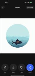
First off, I don't have any illustrator/ graphic design skills, but had a general idea of what theme I was looking for - outdoor california life of ocean/ fish / ski / mountain stuff. So I subscribed to an AI graphic app called Da Vinci, and played around for a few evenings with different prompts to try and help visualize what some of the themes would look like.

In general I'd say if it's a generic prompt, like snowy mountain vista etc, it'd give some interesting and reasonable stuff. As soon as I started trying really specific stuff, it got whacky or trippy fast. I'm sure you could spend more time to refine the prompts, but realized it wasn't worth the effort for me, but was fun for a few evenings to mess around with.

Some examples of results (trying to get something like a poker chip label):

IMG_5801.jpg

IMG_5805.jpg

IMG_5808.jpg


IMG_5848.PNG


The fish specific ones were pretty hilarious out of the ocean related theme:


IMG_6041.JPG

IMG_6266.JPG

IMG_6271.JPG


The main benefit of doing this 'pre-vis' was that I realized my original theme really wouldn't translate the way I'd like it to for a consistent theme across my cash set. So I decided to concentrate on the local ocean wildlife / fishing that I love...
 

Attachments

  • IMG_5990.PNG
    IMG_5990.PNG
    83.2 KB · Views: 23
Last edited:
Now that I had a more focused idea of ocean / wildlife, I could now be specific with my label designer, JB @tallsbutler. First off, I would thoroughly recommend JB for anyone that would like help with a label designer (he also does entire TINA / Ceramic sets, Dealer buttons etc). JB was great in understanding what I was trying to achieve, and really hit it out of the park first time. We had maybe 3 revisions to get to this point.

My chips, pre-murder:

1732338520347.png


Side A:
_ALL.PNG A Side.PNG


Side B:
_ALL.PNG B Side.PNG


@Jacks I think was the only other set I found that had a similar fishing focused theme (stumbled across when looking for something else).
@Taghkanic Hoyle set I really liked for the colors and how they pulled in and used all the elements of the chip
 
Last edited:
For fishing at least out of San Diego, it's all about bait, typically sardines. So I liked the thought of starting off with a small bait fish for the 25c. It's not as common, but I love when all of a sudden flying fish erupt from the water - typically a sign of something bigger lurking underneath - it's definitely a larger baitfish and something the bigger tuna definitely go after.

For the $5, a squid would be more accurate for fishing, however I loved the thought of representing the workhorse $5 chip with an Octopus, representing the camouflage and intelligence needed for poker.

We've had a few awesome days out on the water all because we found a kelp paddy. There is no real structure out on the ocean here, so you need to find either birds diving on bait fish (that'll be pushed up to the surface by tuna etc), or a kelp paddy that has bait fish underneath for protection. We idle up or near the kelp paddy, and it's a great feeling when you throw a sardine or two out and see a flash of color. We've caught both yellow tail (the blank NCV that I'll initially use probably as an All In chip) and Mahi Mahi ($25) this way. The $100 is represented by the tuna - although I've only ever caught up to the 20-30lb 'schoolie' range, they can get to the 60-100lb, even 200lb. So the $100 was reserved for the tuna.

We're working on a Dealer button design, that'll represent the kelp paddy & terns that signal bait fish, and the sardines will be the first out for the blinds... and they'll lead to some bigger fish :)
 
I've been in touch with @Gear & @Wifey - they've also had some good feedback. JB's initial design used the Blaze Orange as the background, however the feedback was that the color wouldn't be that similar when actually printed, hence the switch to the plum for the contrast against the green Mahi Mahi:

1732339954751.png

Gear also advised that probably should focus only on printing Side A, since there might be too much detail/ fine lines on the B side to be seen. They recommended I do some local to size printing as examples, and now deciding if I should get some samples or not, or only have side A on both sides.

My preference would be for textured labels, however listening to @Wifey, sounds like the finer details wouldn't come through or be lost, so the smooth matt laminate would be better.

Cheers

Kam
 
While it is fun and tempting to vary the two sides, I was going to suggest that you either use only one design per chip, or keep the variations quite subtle from side to side.

My concern is that if the two sides are effectively reversed (dark vs light), you may wind up with some very messy and confusing splash pots.

Especially since you are matching base and spot colors on each chip. There’s already a *lot* going on visually.

In any case, excited to see the progress. Looks great overall.
 
  • Like
Reactions: Kam
Re.: Gear color matching: In my experience it really depends on the specific hue and intensity. Some colors can be reproduced almost perfectly. Others are quite tough to match—e.g. hot pinks and intense oranges.

I’d say generally the more saturated, the bigger the printing challenge.

Also the type of inlay (say, textured laminated vs glossy unlaminated) may be a factor.
 
  • Like
Reactions: Kam
I poured the NPR into a small plastic container and used a Q tip to add some NPR to the chip. Just enough to coat it.
 
  • Like
Reactions: Kam
While it is fun and tempting to vary the two sides, I was going to suggest that you either use only one design per chip, or keep the variations quite subtle from side to side.

My concern is that if the two sides are effectively reversed (dark vs light), you may wind up with some very messy and confusing splash pots.

Especially since you are matching base and spot colors on each chip. There’s already a *lot* going on visually.

In any case, excited to see the progress. Looks great overall.
Thanks - appreciate your perspective. I’m going to get a sample of an A & B side for the $5 and see how I feel about it in person before ordering all the labels (Gear also recommended just the A side). I didn’t think of the splash pots, good call.

I poured the NPR into a small plastic container and used a Q tip to add some NPR to the chip. Just enough to coat it.
Thanks - I will try that next time. Tonight I decided to avoid the NPR altogether and just peel, if I hit a crappy chip it went in the ‘f*#k it I’ll deal with it later pile’. The Q tip might help where I’m still using too much NPR, although I’ve done slightly better with a little more experience.

Progress so far - went much better tonight, last barrel will be attempted with the Q tip:

IMG_7343.jpeg

IMG_7344.jpeg


Cheers

Kam
 
Time for a beer with some slice n’ dice. Onto the next rack:

IMG_7371.jpeg
 
Update: not all chips are made equal. Started on the $5 IGs, and the laminate labels on these just pop off as soon as you cut in. The vinyl logo layer just needs a little cut to start, most come off in one or two halves. Strange that the $1 IG gave me a much tougher time with about a 1/3rd needing the NPR dose. First barrel of IG $5s and only one side of 2 chips that need NPR.

IMG_7569.jpeg

IMG_7568.jpeg


IMG_7570.jpeg
 
Update, decision time - welcome and interested in feedback. I’m leaning a certain direction, not looking to make fundamental changes to actual label design, just which option of the below:

1. Original 2 styles on either side of chip (colors somewhat inverse both sides):

IMG_7476.png


2. Alternate 2 styles (colors aligned):
IMG_7808.png


3. 1 label style for both sides of chip
IMG_7476.jpeg
 
Update, decision time - welcome and interested in feedback. I’m leaning a certain direction, not looking to make fundamental changes to actual label design, just which option of the below:

1. Original 2 styles on either side of chip (colors somewhat inverse both sides):

View attachment 1431117

2. Alternate 2 styles (colors aligned):
View attachment 1431125

3. 1 label style for both sides of chip
View attachment 1431126
I'm liking alternate two. Colors aligned make the chip more consistent regardless of which side is up but still gives you both the fish and still one side with the denomination prominent. It is a really sharp looking set.
 
  • Like
Reactions: Kam

Create an account or login to comment

You must be a member in order to leave a comment

Create account

Create an account and join our community. It's easy!

Log in

Already have an account? Log in here.

Back
Top Bottom