No no no. You can't cross breeds like that. Would look terrible.Maybe antler velvet?
You could go totally abstract and try crocodile skin

No no no. You can't cross breeds like that. Would look terrible.Maybe antler velvet?
Ohhh... I don't know about crossing continental divides.No no no. You can't cross breeds like that. Would look terrible.
You could go totally abstract and try crocodile skin
Lace?Ohhh... I don't know about crossing continental divides.
Like a doilie? Or, we talkin' lingerie?Lace?
A true master designer could make it look like bothLike a doilie? Or, we talkin' lingerie?

*Cue a Rorschach Test-themed design*A true master designer could make it look like both
Now I want a topper with a French maid wearing a doilie as lingerie*Cue a Rorschach Test-themed design*
It can be whatever you want it to beWhat color is the blank? Is it a set color or can you just do a blank color , I'm buying a table for both poker and board games
You can do whatever color you want, but by default it's black.What color is the blank? Is it a set color or can you just do a blank color , I'm buying a table for both poker and board games
So the Barrington tables have absolutely no area for the topper to fit under rail, so if the top is slightly oversized, the best thing to do is take your time and trim it down to the correct size. The reason you're getting wrinkle when you slide your hand over the top is most likely that it's pressing against one of the rails, opposite of the direction you're sweeping your hand. The trim should take care of that. I've always found keeping about 1/8" off the rail all the way around is best. Gives it space to flex and ripple when you sweep a pot, and then room enough to return to where it was (seemingly instantly).these are amazing products - credit to @rjdev7 for sure!
looking for a little advice from others on how to get it purely flat on my table and how to eliminate a few air pockets/ruffling when sliding over the topper... it may be mine still needs a teeny tiny trim to get it the right size, but open to all ideas...
here is my classic design that @rjdev7 did an amazing job helping me
The ESPN table has a little room to go back to the rail of lights. I’m going to try the slip pad for my splitSo the Barrington tables have absolutely no area for the topper to fit under rail, so if the top is slightly oversized, the best thing to do is take your time and trim it down to the correct size. The reason you're getting wrinkle when you slide your hand over the top is most likely that it's pressing against one of the rails, opposite of the direction you're sweeping your hand. The trim should take care of that. I've always found keeping about 1/8" off the rail all the way around is best. Gives it space to flex and ripple when you sweep a pot, and then room enough to return to where it was (seemingly instantly).
Also, for getting rid of the split, where the table folds. I always placed a single layer of non skid pad on top of my table, under the mat.
Something like this
Mainstays 20" x 68" Non-Skid Non-Slip Cream Rug Pad https://www.walmart.com/ip/17481636
The small amount of thickness, and the fact that it's honey combed allows the topper to sit on an slightly more padded surface, as well as allow air to not be trapped under it, since the webbed pattern keeps that from happening. It's why rug stays are made that way.
Enjoy!
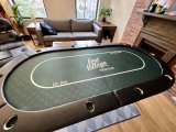
Looks amazing! My poker tables are thrashed after over a decade of bi-weekly use. I’m seriously looking at the 45 x 72 Gorilla Pub to replace them. Great photo to show that it seats 8 perfectly. If I was to order toppers it appears that you already have the size dialed in!Happy mail day to me indeed, new Gorilla Pub table finally arrived
View attachment 1139512View attachment 1139513
So the Barrington tables have absolutely no area for the topper to fit under rail, so if the top is slightly oversized, the best thing to do is take your time and trim it down to the correct size. The reason you're getting wrinkle when you slide your hand over the top is most likely that it's pressing against one of the rails, opposite of the direction you're sweeping your hand. The trim should take care of that. I've always found keeping about 1/8" off the rail all the way around is best. Gives it space to flex and ripple when you sweep a pot, and then room enough to return to where it was (seemingly instantly).
Also, for getting rid of the split, where the table folds. I always placed a single layer of non skid pad on top of my table, under the mat.
Something like this
Mainstays 20" x 68" Non-Skid Non-Slip Cream Rug Pad https://www.walmart.com/ip/17481636
The small amount of thickness, and the fact that it's honey combed allows the topper to sit on an slightly more padded surface, as well as allow air to not be trapped under it, since the webbed pattern keeps that from happening. It's why rug stays are made that way.
") thanks for the help!
thanks for the help!"Full size". Leave it smaller than the topper so the edges don't start sticking outQQ - do you cut the rug pad to the whole size of your table or just use over the join in the middle?
View attachment 1188467
This is roughly what I'm looking at doing. I'm open to suggestions, ideas, and/or other feedback.
@aaron2786 - consider this a substitute for a PM?

View attachment 1188467
This is roughly what I'm looking at doing. I'm open to suggestions, ideas, and/or other feedback.
No tartan for me. I was one and done lolView attachment 1188467
This is roughly what I'm looking at doing. I'm open to suggestions, ideas, and/or other feedback.
@aaron2786 - consider this a substitute for a PM?
If there's an easy modification for the one I've done? Eh, maybe?View attachment 1188467
This is roughly what I'm looking at doing. I'm open to suggestions, ideas, and/or other feedback.
@aaron2786 - consider this a substitute for a PM?
You in the thread homieretracted
I’m throwing dice on it right now. It’s a bit bouncy but if I can master throws on this then I’ll be good to go on the casino tables
Because in a self dealt game, not every player can reach the designated location. It also detracts from a good design.Another question -- why don't most of these table tops have a designated location for the flop/turn/river to be dealt?